Project Updates
-
inFORM Final Paper + Presentation
Final Report
https://drive.google.com/file/d/1UJ0X6nOU0fVJFBYCLG16DwopqCPwvTkJ/view?usp=sharing
Final Presentation
https://docs.google.com/presentation/d/1gVqD2Vu0UVNROSwqsAVLHJprq8BktDMasJrK0jfoxAc/edit?usp=sharing
Code Repository
-
MuseConnects | Final Update -- JL, RS, LR, AN
Hello hello,
Here is the link to our final presentation: MuseConnects Final Presentation
Here is the link to our final project proposal paper: MuseConnects Final Paper
Thank you for the semester! Signing off :)
-
Meditation in the Museum Final Project Presentation
https://docs.google.com/presentation/d/1IdfaDF7Hbfi0dbc3oK4yPZMhM3AqD5cY/edit?usp=sharing&ouid=101328927074097265439&rtpof=true&sd=true
-
Meditation project presentation
https://drive.google.com/file/d/118mQL0CztXpu43OGY0ioEJg1iKXsqGjn/view?usp=sharing
-
Project Update
Demo
Reccomender system online demo: https://musuem-project-frontend.vercel.app/
Todos
- add an interactive ui to score potential new exhibit descriptions
- add ui to view the relative performance of displays(maybe larger bubbles for more popular items)
- add more explanation about the process on the website(i.e. describe how we are using different ai models)
- waiting to hear back from debby about hanging cameras in museum
-
Meditation Project Update 5/1
New Project Update Slides (update at bottom)
https://docs.google.com/presentation/d/1Atq1nfPbl6PgfO-WkcUPnnYIk1KmL6T6/edit?usp=share_link&ouid=101328927074097265439&rtpof=true&sd=true
-
inFORM Project Update
We’ve worked on a few things since our last class update:
- Further developed and refined our design of the screen user interfaces: https://www.figma.com/proto/C6vcwS4k8eBScF1i8xSXNf/inFORM?node-id=3-32&scaling=min-zoom&page-id=0%3A1&starting-point-node-id=3%3A32&show-proto-sidebar=1
- Coded web app for inFORM (open up tabs on different computers to simultaneously manipulate inFORM): https://inform.herokuapp.com/
- Developed new concepts of exhibiting inFORM: playing music, typing out a simple message, modeling a cityscape/landscape
-
230501 MuseConnects Project Updates - JL, RS, AN, LR
link to the prototype: https://drive.google.com/file/d/1dHLy0d1FGX9GvPcZAU-ibgP2RX6oo3N7/view?usp=sharing
link to the design: https://www.figma.com/proto/ZVSrnm8R2P88IrQMtd8XWd/interactive-prototype-3?node-id=1-8&scaling=scale-down&page-id=0%3A1&starting-point-node-id=1%3A2
updates:
- sent a proposal to Debbie and Ann (and the MIT Museum Visitor Experience and Museum Programs teams) about two test runs to take place over the next two weeks
- will continue prototype designing, final paper writing
-
project-updates
Project Updates
https://docs.google.com/presentation/d/1yZ8WpGN2QZ3aF_KtygGk2gUGjetXmmzu_SbrxUrC0Aw/edit#slide=id.g222412e8d9c_0_29
-
pop-up-museum-updates
Project updates in our powerpoint here:
https://docs.google.com/presentation/d/1Ah8v21Hm11mmmKwvRH0PVhUtMR4evsSoHOTsVY6pZTw/edit?usp=sharing
-
Meditation project update 4/19
- Reached out to Debbie - thinking about how to incorporate current cool Exchange animations / projections into this project since I’m not an op art design kid
- I’ve decided which meditative practices I want to show, and worked on their presentation:
Introduction to MIT Firehose Culture (1 minute) Where meditation stands (1 minute) Guided 2 minute practice (random)
- Grounding: Ujjayi breath (Darth Vader breathing)
- Exploratory: Following the breath
- Open awareness: Watch the mind
- Focus: Watch the candle Closing statement (1 minute)
Currently writing up scripts for each section. This week, will record audio narration + guided practices (by me unless I find a volunteer with a really nice voice, otherwise… I might have to make some magic on Audacity…). Then, will start creating simple animations for looping slide deck for background. Next week, make animations for guided meditations
- Question: I’m really good at using powerpoint for animations and stuff (figured it out sometime in elementary school?). I don’t think that’s how people do things in industry. Recommendations on simple software to use for animations / graphics / videos? I’m thinking big blocks, translations, stuff that I could’ve done with powerpoint. Also debating between making animations for guided meditations and filming myself- thoughts?
Update at bottom of slides: https://docs.google.com/presentation/d/1jz2Y-RLkzvB3_Snsighde501saT00roY/edit?usp=sharing&ouid=101328927074097265439&rtpof=true&sd=true
-
inFORM Project Updates
Updates
- Initial designs and mock-ups
- See slides!
- A detailed description of your updated technical approach (if applicable)
- See slides for diagrams/images
- Two computers can interact with the web server
- These are representative of the consoles in the museum
- Interact with inform by using mouse rather than kinect
- Otherwise the same as the proposed solution
- Web server holds internal state of inFORM system
- Array of pixel locations on the inform
- state is updated whenever an input computer manipulates the state on the inform
- Output computer pulls new state in real time from server, displays what the inform would show
- Results from audience research/observation (if applicable)
- N/A
- Any other updates such as changes to the original concept, conversations with museum partners, etc
- in contact with Debbie on what an exhibit with inFORM might look like at the MIT Museum, we’re trying to get in touch with members of the Tangible Media Lab to understand the engineering aspects underneath the machine
- Questions or issues that you are struggling with
- N/A
Link to Presentation:
https://docs.google.com/presentation/d/1IReLXlz2TLvcmTHZT61fu2vJe1ODd5LH-cP84j7WWrM/edit?usp=sharing
- Initial designs and mock-ups
-
Wed Apr 19 MuseConnects Project Updates - RS, LR, AN, JL
Here is the link to our MuseConnects Update Presentation.
- Initial designs are linked within the slide deck and also here.
- From audience observation and user feedback we learned, amongst other things:
- Half of all observed visitors interact and/or take photos within a gallery
- Some kind of engagement is desired
- The dynamically (dis)appearing responses and seeing the response move onto the wall is compelling and would get engagement
- Looking for low-stakes, simple, quick ways to engage with an interaction piece
- Prompting, scaffolding, agency for different ways to engage within the interaction piece (respond, react, comment) are important
- A compelling, open-ended question is key to getting engagement
- Changes to the original idea are slight: we are focusing on short response – one way to engage for one exhibit – and keeping the original elements of being able to respond and react to others’ responses. We are now utilizing projection technology to provide a better aesthetic and larger visual impact for visitors.
- Questions we continue to work on:
- Is the “Share” button meaningful?
- What can we do to maximize both the likelihood that people will engage and the quality (informational, interactional) of their experience? a. How can we make sure the cognitive load isn’t too high so that people do actually engage with this? b. What aesthetic approaches are enticing and inviting while not detracting?
-
Project Updates for Reclaiming the Pop Up
April 5th Updates
Project Updates for Reclaiming the Pop Up
Given some initial comments made during our presentation time, we have been thinking about the scale and expansiveness of our project. One extremely helpful reading and resource has been the Micro Small Museum https://micro.ooo/ concept. It is very similar to the free library or library in a box concept https://littlefreelibrary.org/ that has become popularized recently and we have also seen it in spaces around Kendall.
However, we hope to carry some of our initial concepts and goals despite scaling down in a physical manner:
- A physical foam board prototype of a micro museum model
- AR development and HCI (Human-computer interaction) with tactile inputs
- An exhibit centered around one theme that engages viewers through interactive exhibits in a variety of perspectives
And we have done:
- Researched the development of entertainment and amusement park design theory (Disney and Universal studios) to create immersive environments
- We have been starting to build the model and framework for a tool that can track visitors’ physical movements and generate unique, interactive visualizations based on their behavior. We have already been collecting data for the model training step, which is a significant step towards developing a functional product.
- We are working on creating a detailed journey map that outlines the step-by-step experiences visitors will get, starting from the second they step into the pop-up museum.
- Given the comment last time, we narrowed down our goal and made it more clear and specific.
- We are also working on developing a narrative and designing the experience.
- Inspired by the reading, we decided that there should be a cohesive theme for our pop up museum, such as having a consistent color theme, and we have been drafting ideas for the cohesiveness and the overall environment we want to create for the museum.
-
project updates
Project Update
Outreach:
- Debbie Douglas: We’ve made contact and she has indicated that it is likely that MIT Musuem would be interested in hosting this in an exhibit. We’re in the process of scheduling with the relevant decision makers
- MOMA connection: We reached out to some friends to someone who works in the donation office at MOMA, and she speculated that our project could be useful for quantifying stastics for donors who are focused on objectives and using this as a tool to raise more money.
Technical: We’ve acquired needed equipment and successfully run a model on images online that counts people in a room, our first objective. Next step is connecting the cameras and locating a dataset to meet the objectives of the musuem
We also looked into methods for performing analytics that allow museums to better understand visitors’ preferences. We will use the following information to characterize a particular piece of work:
- Content: we will use the machine learning model CLIP, a multimodal model that combines knowledge of English-language concepts with semantic knowledge of images, to generate text descriptions of the artworks given the images
- Theme: this will be determined from the curators’ descriptions
- Other metadata: artist name, year, medium, etc…
-
MuseConnects Project Update
Since our last class meeting, we have begun conducting observations in the MIT museum, looking toward to how museum-goers are interacting with the content already available. As we observe, we are looking to learn more about when/how users engage with interactive components in the museum. Are they talking with others as they do so? Are they making their way through the museum more independently? Are they looking extensively, or quickly moving on? The information that we gather from our observations will hopefully help us consider how we design engagement with our project.
Further, we’ve appreciated the ideas promoted in the readings from Session 14 on storytelling in museum spaces. We’re thinking about the notion of choice that came up in Ferreira’s “Can You Apply Transmedia Storytelling to Museums?” As Lamees noted on GitHub, this reading prompted us to consider how the audience should have choice in how they want to consume museum content, as well as the level of participation they want to have with it. Though we initially thought about ways to provide choice in the options of engagement with our project, this reading as well as the comments from our pitch remind us of the importance of having multiple means of engagement within each device/tablet. This would allow for even more freedom of choice for the visitor. Along with this, the Hollander piece on transmedia storytelling encourages us to consider consistency and coherency between tablets/devices that we create.
—
From comments from our pitch presentation, there were suggestions of making the text/input/engagement more publicly and prominently displayed (e.g. if a user inputs a word to be added to a word cloud, that word is temporarily projected onto the wall, etc.); different forms of these are definitely things we can consider. One example could be using the white space around the exhibit descriptions within the MIT Museum. The visitors would be prompted to share their feelings in short phrases at the end of the exhibits and their answers would be projected at the start around the description along with others’ responses for newcomers to see. If we do go along that path, there may also be space for the user to be projected as well; what might be the impact of having the user projected on the wall alongside / surrounded by their word they input, before then seeing the word move into and contribute to the word cloud?
Would that make the interaction too central and detract from the exhibit? Is that a point?
For the word cloud, there was some thought on how that may not be engaging or dynamic enough; what if there was a daily / weekly / less-than-all-time word cloud as well as an all-time word cloud, that way it would be likely that everyone would see their contribution in at least one cloud, even if it’s a completely unique contribution.
To the comments on how physical things may be more meaningful than digital because they’re tangible and you can take them home from your visit physically, we could also explore the idea of printing something. However, if the whole interaction / participation is more personally involved (i.e. like if the visitor were to see both themselves and their word projected / their word as part of a word cloud they’re actually contributing to) — the digital means of saving and taking home may be more able to capture the full essence of that, taking advantage of the affordances of digital technologies.
Another suggestion we received from our pitch project was giving the visitor more choice when interacting with the tablets. Initially, we proposed each tablet to consist of a single prompt and activity type. However, someone mentioned that this may be limiting for the visitor. What if they wanted deeper engagement with the given exhibit/display, but were not interested in the particular prompt on the tablet? What if they have thoughts relevant to the exhibition, but are not accommodated by the prompt at hand? One thing we may consider is having the tablet focus on a more broad theme (still related to the exhibit), and include multiple prompts based on that theme for the visitor to choose from. While our group is focusing on prompting as a means of provoking engagement, it may also be interesting to include a section on each tablet that is unprompted and gives the visitor as much flexibility and freedom to engage with the exhibit.
-
Meditation Project Update
Integrating the project into the MIT museum:
I’ve been thinking about how this project might be unique to MIT in particular, and I thought of how the mission statement was about turning MIT “inside out”. There’s a lot of projects showcased in the museum, but not so much about the people and the culture at MIT. I’d consider life at MIT an aspect of the “inside” that isn’t really shown to the “outside”. Although I can’t speak for grads, PHDs, and all the other people involved in the community, I can definitely speak for the undergrads.
Firehose culture!
MIT has a lot of stereotypes, some true, some not so much. There is what we call firehose culture here though! Here’s MIT Admissions comment on it:
What does “drinking from a fire hose” mean? Getting an education from MIT has been likened to taking a drink from a fire hose—the sheer number of opportunities and rigor of our coursework can leave students feeling hosed. So it’s only fair that students must pass a swim test in order to graduate!
Although this may or may not be experienced by other visitors, I felt a similar experience going through the MIT museum. There’s so much cool stuff happening and being showcased, yet at some point, I ended up feeling “hosed”. There’s a lot, almost too much. I’m curious about them all, but can’t at the same time because there’s so much to think about.
The exchange space on the second floor can be a wonderful place for visitors to pause and reflect on the exhibits and take a mental break before going to the 3rd floor, which is even more packed with various cool gadgets and things to explore. To expand on the initial concept, I was thinking of using this place when it’s idle to show visitors MIT’s culture (the “people” side of the “inside”) and also express the importance of pausing to swallow before continuing to drink from the fire hose.
My GRA asked me yesterday what I do with my free time to reset. While I was able to give a firm answer, many others weren’t. Most breaks were unintentional, and don’t really feel like “breaks”- but rather a time skip to the next drink. She told me that she’s been trying to be more intentional with her breaks. It’d be nice to be able to introduce that with people.
Contents!
As for contents displayed on the screen at the exchange, I was thinking of introducing 4 types of meditation and where/when they could be used, as well as an example practice for each. This would be in addition to introducing “firehose culture”.
- Grounding practices, in comparison to
-
Inquisitive/Exploratory practices.
- Open awareness practices, in comparison to
- Practices for Focus.
Practices include:
- Ice diving/bath, ujjayi breath (breathing like Darth Vader through the nose)
- Following the breath- where does it go? Can you feel it at weird non-intuitive places? Listening to your internal sounds- plug your ears and listen!
- While meditating, asking yourself what you are/your identity is, and ask where that comes from.
- Trataka- gazing at a lit candle (with a set of instructions)
These can be relatively short practices, so visitors can easily move on to the third floor afterwards with a fresh state of mind.
-
inFORM Project Updates
We’ve reached out to Debbie about our interest in working with the Tangible Media Group. She’s corresponded with Hiroshi’s lab manager as well as the director of galleries and exhibitions at the MIT Museum and has received positive responses from both of them about our project on this exhibition. We’ll be following up with her to discuss also our ideas and vision for the inFORM.
We have also connected with Daniel Pillis from the MIT Media Lab Tangible Media group. He works for Hiroshi Ishii, and has allowed us to explore the inFORM and transFORM. The group has been made aware of our intent to create an exhibit for inFORM, and they are looking forward to working with us.
We were also able to observe users interact with the inFORM during the MIT Media Lab spring meeting. Hiroshi was running demos, and I was able to watch people play with the machine. It attracted quite a bit of attention, and people like the physical aspect of the machine. People were especially interested in moving the ball, and I also observed two people “pass” the ball back and forth by using the machine together. I also observed young kids using the machine, and they were equally fascinated by it and had no trouble learning how to use it.
-
meditation project proposal
-
Data Analytics for Museums Pitch
https://docs.google.com/presentation/d/1zksSEbIUIN9rrHAzW7xK-njtR0vs6P5puhA4IIM9iuc/edit?usp=sharing
-
pop-up-project-pitch
-
MuseConnects Pitch Presentation Deck - RS, JL, LR, AN
Hello! Please go to this link to see our pitch presentation deck. You have commenting access, so please feel free to leave questions, thoughts, curiosities!
-
inFORM Project Pitch
https://docs.google.com/presentation/d/1gQpHNXfLHIkvnVawsUo-nr7pGVFr_nzH3X9Eep2Wt2g/edit?usp=sharing
-
MFA Reframe Activity


The selected reframe object is Nishida Jun’s ZETSU #8. The two reframe ideas are centered around the location of written description and the emphasis on the design process.
At the moment, the objects are located in the center of the room,enclosed by glass boxes, whereas the written description is on the surrounding walls about seven to ten feets away. From our experience, having descriptions of exhibits far away from the objects can have a negative impact on the visitors’ experience in a museum for several reasons. The first reason is the lack of context. When the description is far away from the object, visitors may have a hard time connecting the two. They may have to spend more time searching for the description, which can be frustrating and distract from the overall experience. This lack of context can also make it harder for visitors to understand the significance of the object.The second reason is the cognitive load. When visitors have to go back and forth between the object and the description, it can increase their cognitive load. This means that they have to work harder to process the information, which can be mentally exhausting and may reduce the amount of information they retain. Having the description far away can also result in disrupting flow. When descriptions are located far away from the objects, it can disrupt the flow of the museum experience. Visitors may have to backtrack or go out of their way to read the description, which can disrupt the overall narrative of the exhibition. Therefore, our proposed reframe is to implement augmented reality with audio reinforcement at locations closer to the objects.
The second reframe idea is to expand the description of the design process. As for now, the description only includes the production phase of the object. We believe that touching on the design phase, such as how the designer twists the modules, thinks about the different possibilities, and eventually ends up with the selected object, can be very helpful for the user experience. First, it will enhance the visitor’s understanding. By including the design process, visitors will gain a deeper understanding of how the object was created and the thinking behind its creation. This will make it easier for visitors to appreciate the object’s design and functionality. In addition, understanding the design process can provide context for the object’s creation. Visitors can gain insight into the social, cultural, and historical factors that influenced the design process. The design process can also showcase the designer’s creativity and problem-solving skills. By sharing the design process, visitors can better appreciate the designer’s contribution to the creation of the object, engage in the exhibition more actively and ask questions about the object’s design, and learn about the different steps involved in the design process and the role of design in shaping the world around us.
-
ReFrame Assignments
The God with Clipped Wings
 This reframe acknowledges the displacement of the artifact and tries to highlight the piece as it would be in its original context. The added visuals in the description and around the piece successfully help the viewer envision how this artifact was meant to be displayed. The visual around the artifact is quite basic though, and I’m wondering if AR technology could be used to enhance seeing the artifact in its entirety as opposed to simply a sketch.
Ba’Altega

 This ReFrame directly addresses the viewer and asks them to consider the full sensory experience that would have occurred when seeing this piece in its original placement in a tomb rather than a museum. This is an attempt to honor the piece’s original context, though this attempt is lacking in a description of how the piece was acquired. There are also a few ways to expand on just a description of the sensory experience of viewing the artifact in its tomb, such as through AR technology or even fully recreating some of the described surroundings.
Summer Orange
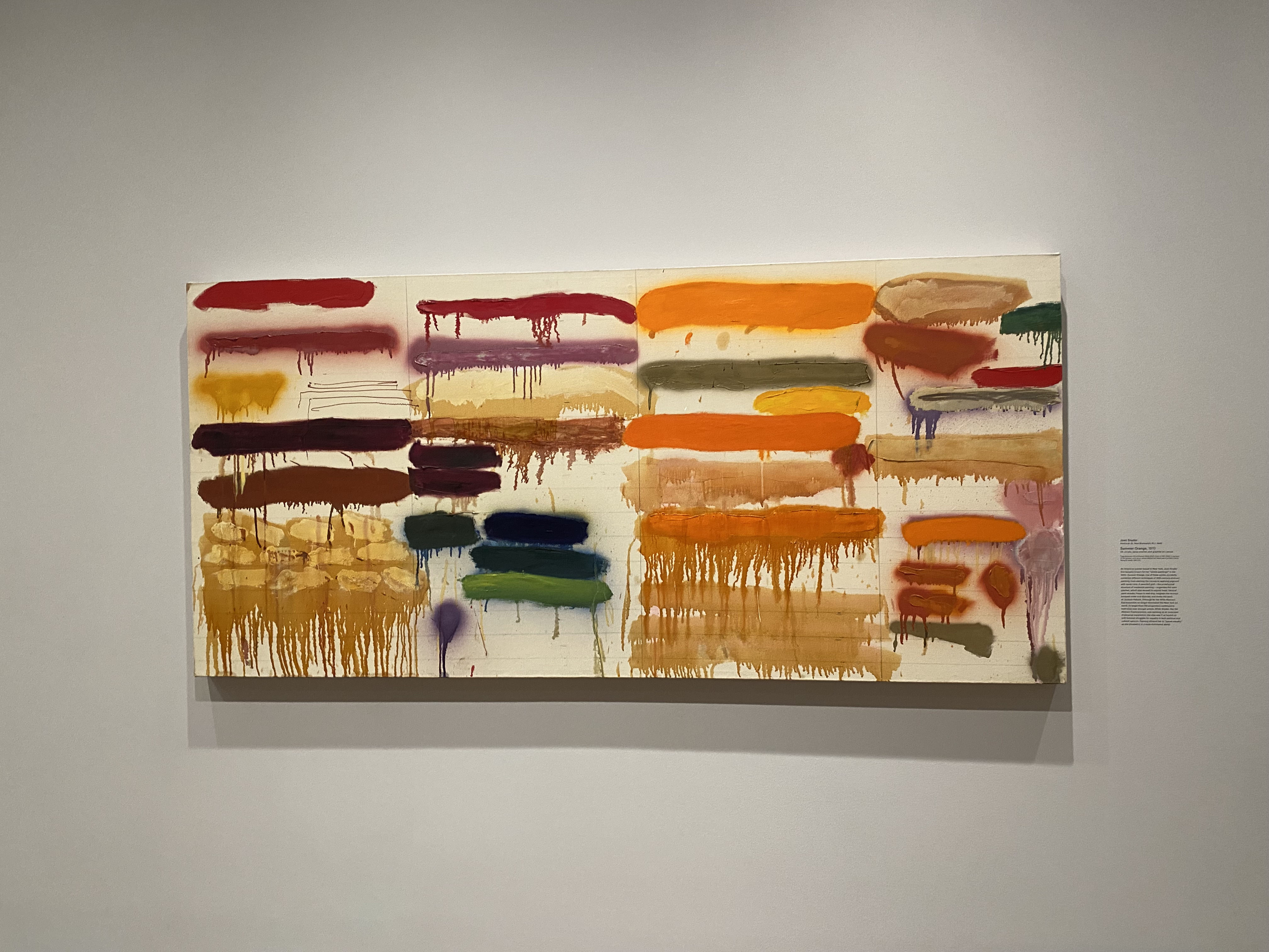
This piece and its description really interested me, and I believe there is a lot of room for exploration with a ReFrame sign. First, the sign references the works of Jackson Pollock and 1970s abstract expressionism. I would love to see this piece compared to those; perhaps there could be a screen with similar paintings / ones Snyder took inspiration from and viewers could annotate the pieces with where they saw similarities. Further, I would love to hear more about how painting ties in with “feminist struggles for equality” and how painting allowed Snyder to “speak visually . . . in a male dominated world.” I think seeing this piece in context of her other pieces / other pieces that address similar themes could be interesting and give room for a further exploration about how such an abstract piece is tied to feminist themes.
-
Reframe
Reframe 1

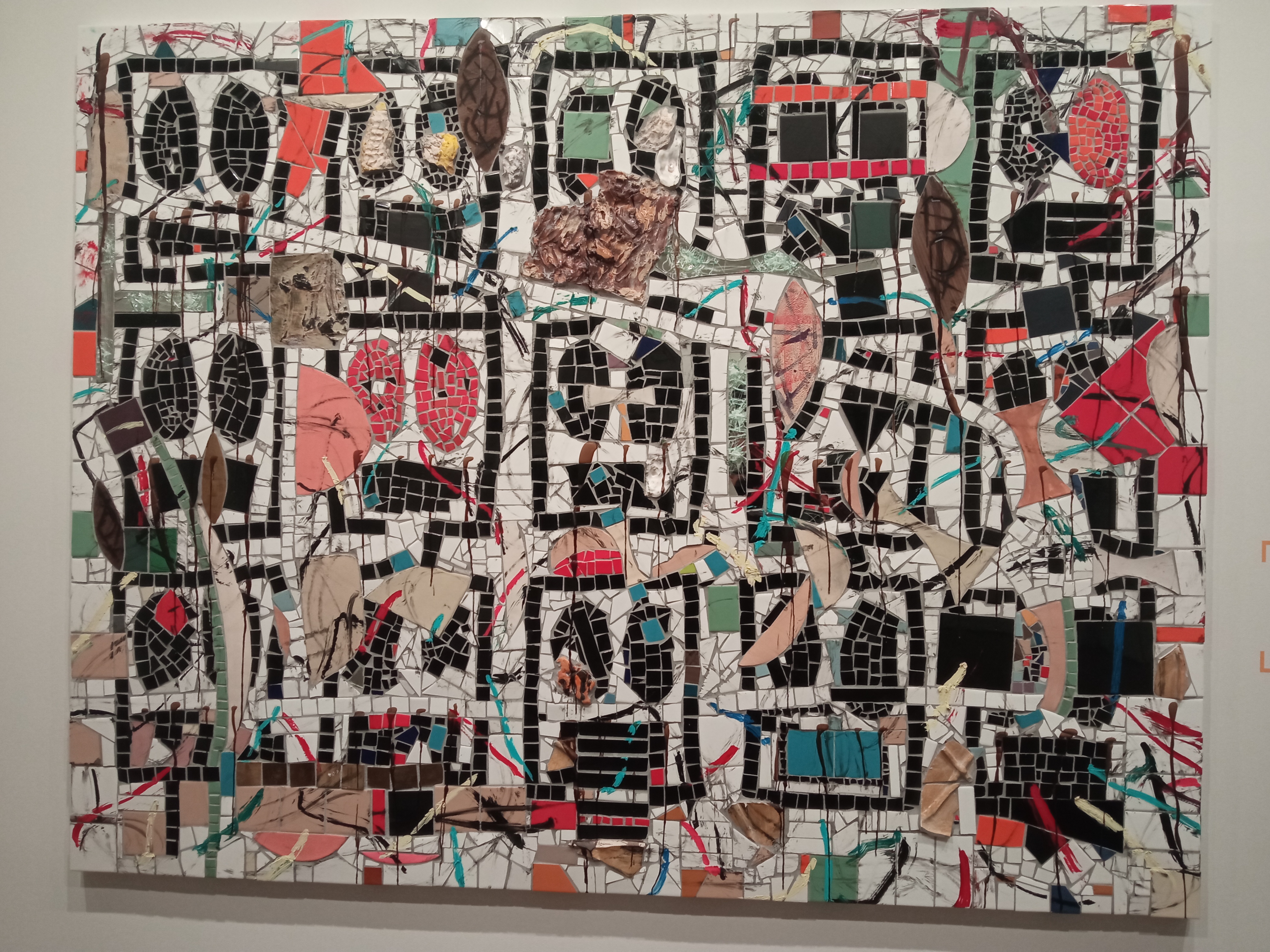 Usually mosaics are associated with more “serious” art with political or religious associations; for example, in the Soviet Union, mosaics are created for propaganda reasons that glorify the Soviet achievements and emphasize the ideology of the communist party

In Islamic art, mosaics are rich in symbolism and the creation of them is an expression of faith.

This mosaic piece is quite surprising at first, as if it’s an oxymoron of using a serious medium to feature a deconstructivist modern art piece. The reframe of this mosaic piece is interesting because it describes the theme of the work well. In addition, it also describes the materials used in the piece, which also have significance and are unconventional.
Reframe 2
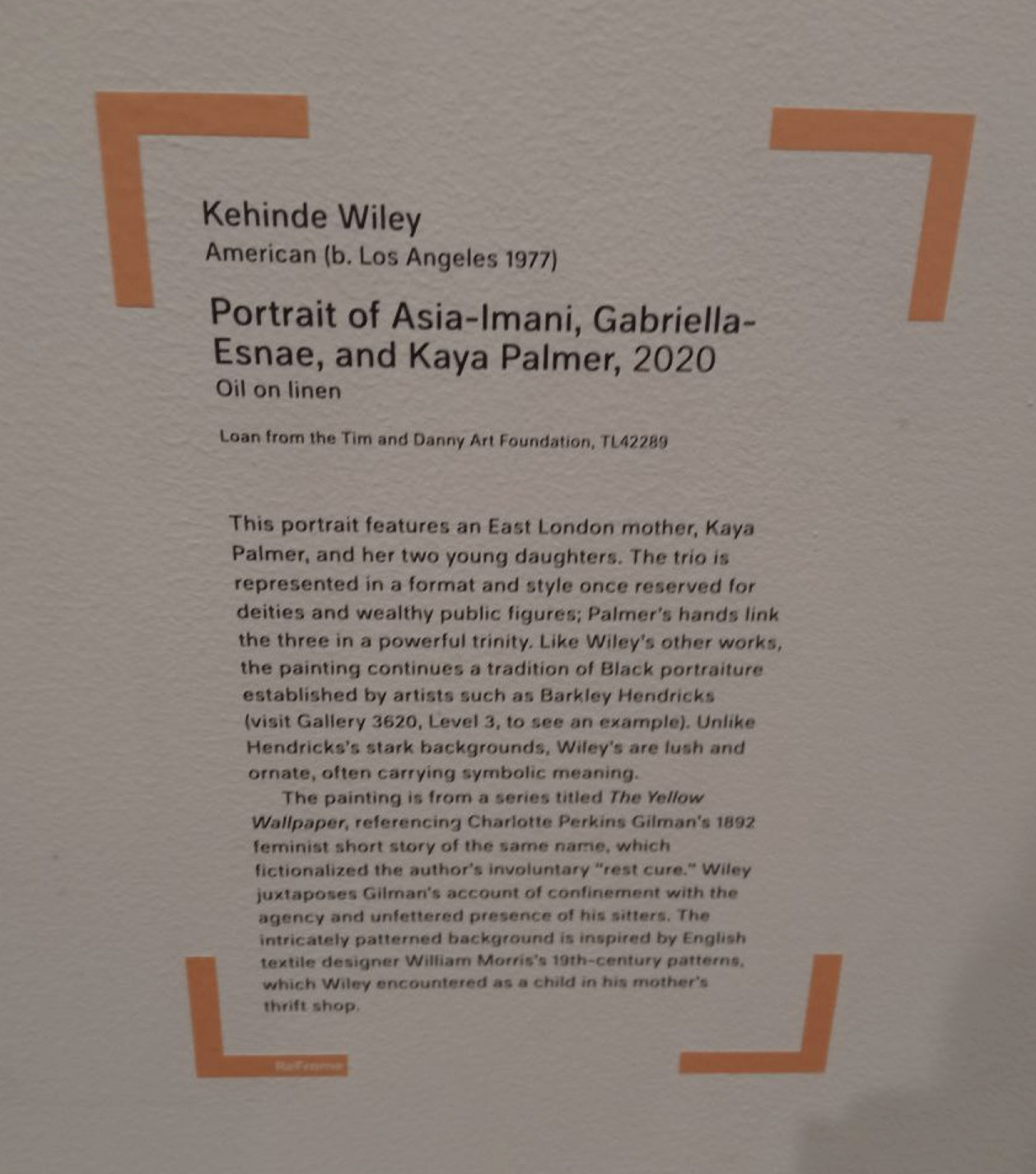
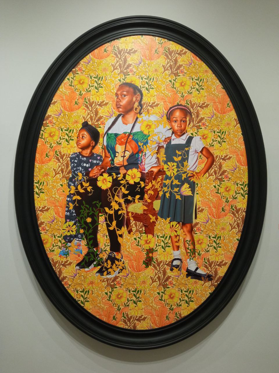 The existing description on this reframe connects it to Kehinde Wiley’s larger series of works under The Yellow Wallpaper project on a very surface level. We’re told that the project is referencing a famous feminist short story (of the same name), but not much more about the story itself. There’s an interesting dialogue between the short story and the painting - primarily in how Kaya Palmer and her children are juxtaposed with the [story’s] maddeningly yellow wallpaper, possibly meant to signify the weight of cultural heritage and flawed societal beliefs/expectations. Charlotte Perkins Gilman herself was both a eugenicist and a feminist, making Wiley’s interpretation of the “sickly” yellow wallpaper even more intricate and complex.
The New Images exhibit (of which this is a part) doesn’t offer significantly more cultural context, so it’s hard to put this together without extensive google searching. It’s a little unfortunate that all this depth is missing from the description - perhaps this is a situation where the art really does require a guided tour from the curator, but then how would an everyday visitor be able to parse the ReFrame sign? One resolution might be to include an online system for keeping more long-form descriptions of surrounding context behind the ReFrame works specifically. Ideally such a system would allow viewers to quickly get more information for the selected designs (possibly through a QR code), possibly with some additional community engagement features.
Additional Reframe
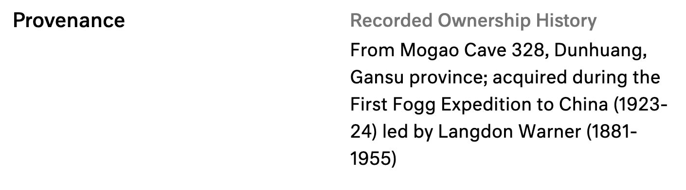
Despite the museum’s efforts in tracing the troubled history of the collected objects, there are some things that are understated. A museum can be portrayed as a passive party having a collection of objects that have a troubled past, but it can also be an active participant in the acquisition of the objects. In the case of the Harvard Art Museums, one example is the Fogg expeditions, as described in this article from 1925. (https://www.thecrimson.com/article/1925/3/20/second-fogg-museum-expedition-now-preparing/). One potentially interesting reframe can be describing the history of Harvard’s archaeological expeditions and what objects were acquired from them, as well as the associated controversies.

-
ReFrame - Untitled, Untitled Broken Crowd, Statuette of the god Bes
Untitled - Existing Reframe Sign
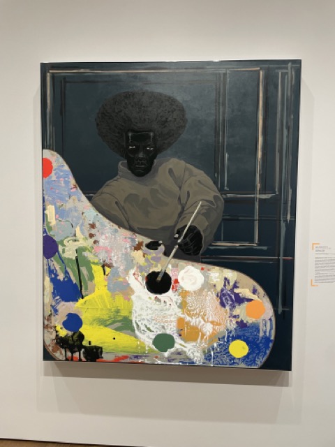
This first painting, Untitled, has a reframe label. I was really interested in how it described how a Langston Hughes essay encouraged black artists to paint black people, and how this painting could have been a reaction to that essay. However, I was a little confused at first, because it was not apparent to me at the beginning that the artist of the painting was black. This was only referenced at the end in a roundabout way, where the label says that the abstraction in the painting is “incidental to the black artist’s process.” This allows the reader to assume the artist is black, but it never directly tells you. I do understand that this is a touchy subject, and that usually this information is not explicitly started. However, I feel very strongly that this is not a fact that needs to be hidden in the reframe label. I read through the whole label, and only at the last sentence did the context of the label make sense to me. Some information about the artist at the beginning would definitely improve this label for me.

Untitled Broken Crowd - Existing Reframe Sign
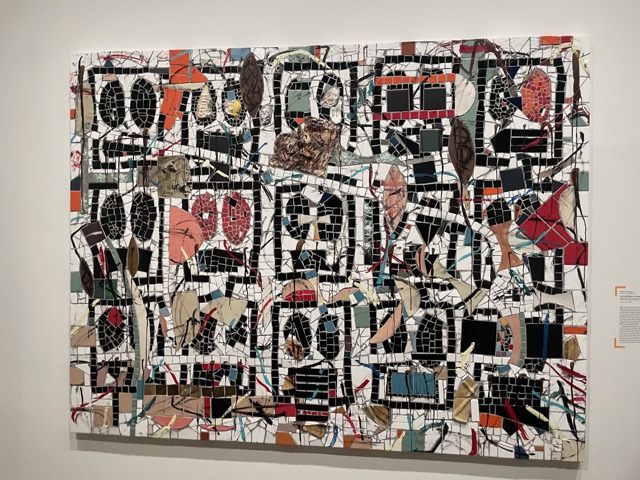
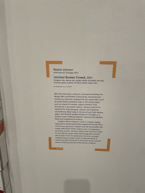
The next work, Untitled Broken Crowd, is a large board covered in various tiles and objects. It also has a reframe label. This reframe label explores the types of materials used in the work, and the connotations that come from using them. It then suggests that these materials emerge the theme of “reckoning with the trauma of structural racism.” In my opinion, the label does not provide enough context to explain how this theme was settled upon. The label does reference that this work is part of a continuing series, but does not elaborate upon what that series is or what it represents. I think that this label would greatly benefit from describing elements of the collection and how the artist is, as this could provide context for why these themes emerge in the work.
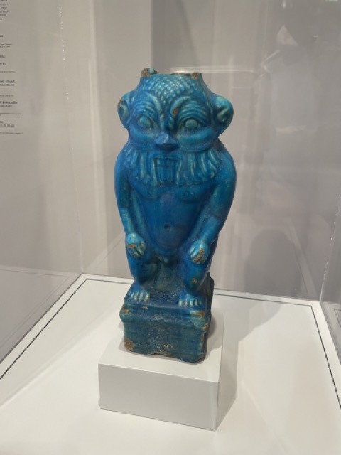
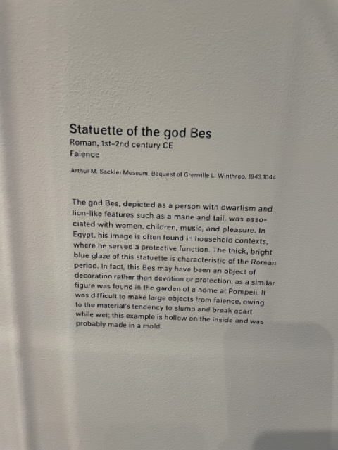
Statuette of the god Bes - NEW Reframe Sign
I was interested in this work, as it is extremely old - from the 1st-2nd century CE. It is a roman sculpture, but does not have a reframe sign. This made me question some of the other ReFrame signs. At what point does a work need to be “ReFramed?” The Benin Bronze in the museum has a ReFrame sign, and these belonged to Benin. Benin does not exist anymore, but the public opinion largely states that these statues should be returned to the area in which they were taken from. This raises the question of extremely old things - should Roman artifacts be returned to the area in which they were taken as well, even if it was 2000 years ago? Given that so long has elapsed, it is extremely likely that this object was taken immorally or illegally at some point. The chain of ownership is presumably unknown, so how should that be handled? I think this is a really interesting subject - where do we draw the line for returning objects in museums to their rightful owners. I propose a reframe sign for this sculpture that tackles some of these issues, and tries to track down some of the chain of ownership of this statue. With objects this old, the chain of ownership and the history surrounding the object is arguably more interesting than the object itself, so I would like to see a label that tries to explore some of these issues.
-
Alluvial Data Visualization
Using Alluvial Graph to visualize overlapping tags
Taking inspiration from Max’s example, I decided to use alluvial graph to chart the top-occuring tags between “man” and “woman” pictures as a different visualization method.
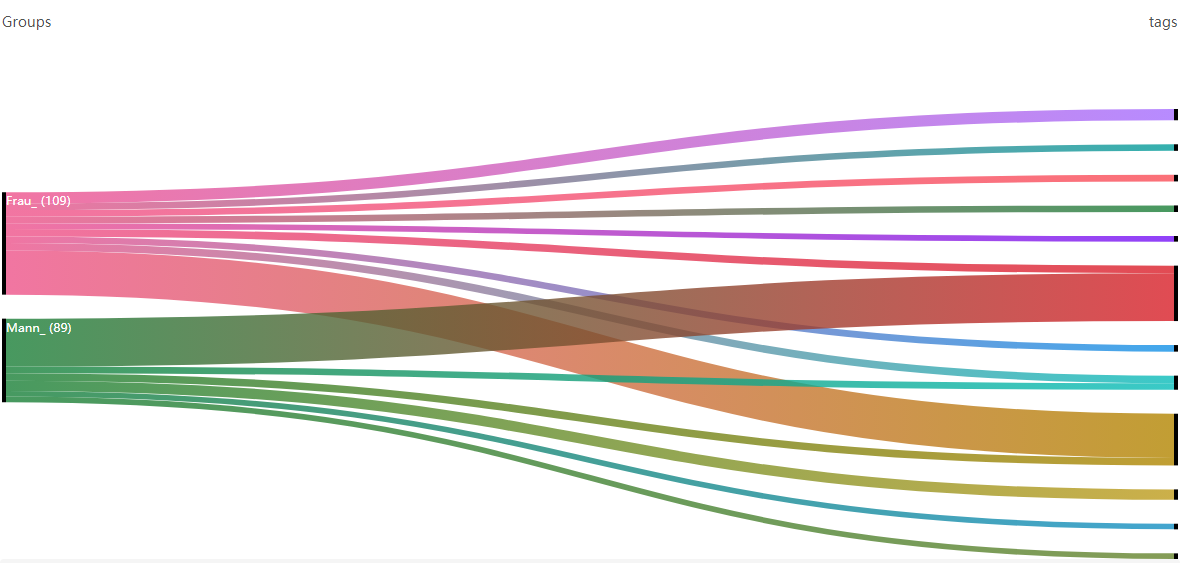
Here’s the link to the Observable notebook: https://observablehq.com/d/245e9fed46b31fc7
-
Reframing the Harvard Art Museums
Existing ReFrames: a Sphinx and a Falcon
Two existing ReFrames that I appreciate can be found on the third floor: “Whose Tomb is This Sphinx Guarding?” and “Horus falcon wearing crown of Upper and Lower Egypt with uraeus.”
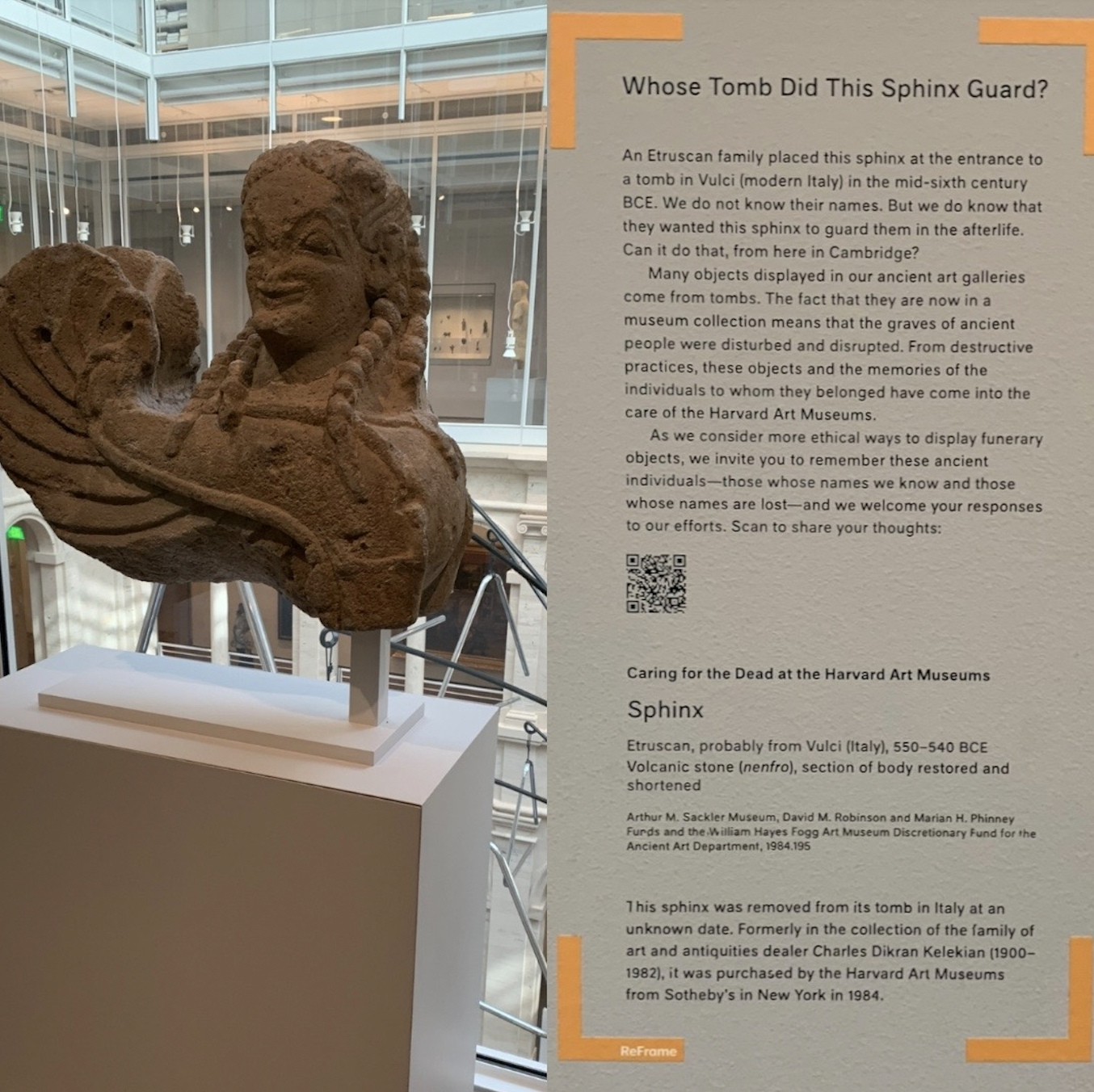
Something that has come up in a few conversations with one of my colleagues is that of provenance, especially in regard to ancient Egyptian work: the Sphinx points toward those conversations. The Sphinx’s ReFrame asks us to consider the meaning of this piece of art in the context of Cambridge versus that of its original intention. There are a number of objects at H/AM and at museums around the world that were originally from tombs, meant to guard a body in its afterlife. What I appreciate about this ReFrame is that it asks us to reckon with this: “Can it guard someone in the afterlife from here in Cambridge?” The label further invites viewers to share what they think regarding funerary objects and ethical display via QR code. In terms of improvement, I wonder how the experience of this conversation would change if visitors were able to see what others think as well–if the QR code led to more of a blog-format than a single response survey on Qualtrics.
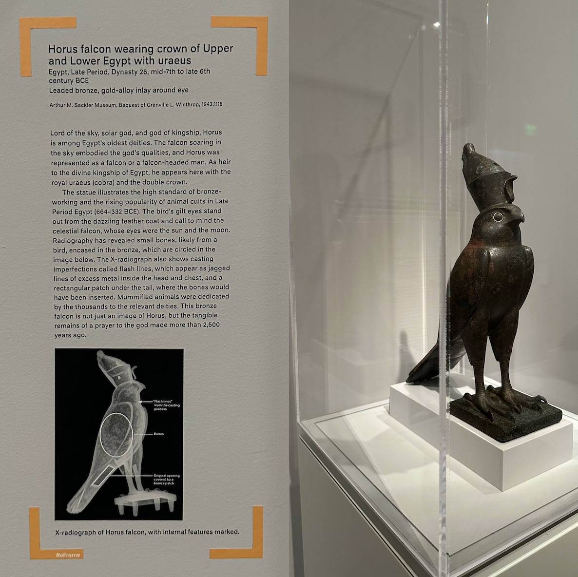
Around the corner from the Sphinx, you’ll find the Horus Falcon with its accompanying ReFrame. I chose this ReFrame to highlight because it feels unique to the ReFrame project. Many of the ReFrame labels throughout the museum connect strongest to the mission to “shine a light on difficult histories” and “investigate untold narratives,” but the falcon label seems aimed to highlight something a little different from that, or unexpected: science. Rather than asking us to engage with cultures seen and unseen, this label highlights some of the interesting conservation work that is done at H/AM. Inside of this bronze falcon is another falcon, one that has been mummified and discovered in an X-radiograph, discovered during routine conservation efforts at the museum. Something that I love, and I know some of the students I’ve worked with this year appreciate too, is when museums make efforts to bring the behind-the-scenes highlights to the fore, and I think that this ReFrame label does just that. Along with the science behind the ReFrame, it also asks us to consider devotional objects, but doesn’t go quite as far as to ask us how to think about them. At the end of the ReFrame, the curator points out that this object is the “remains of a prayer to [Horus],” which, I think, begs the question: what is the (ethical) place of devotional objects in museum spaces? I wonder if this ReFrame could’ve been another opportunity to spark institutional understanding and critique, to push visitors to consider this and discuss it with others.
Considering a new ReFrame: Special Exhibits
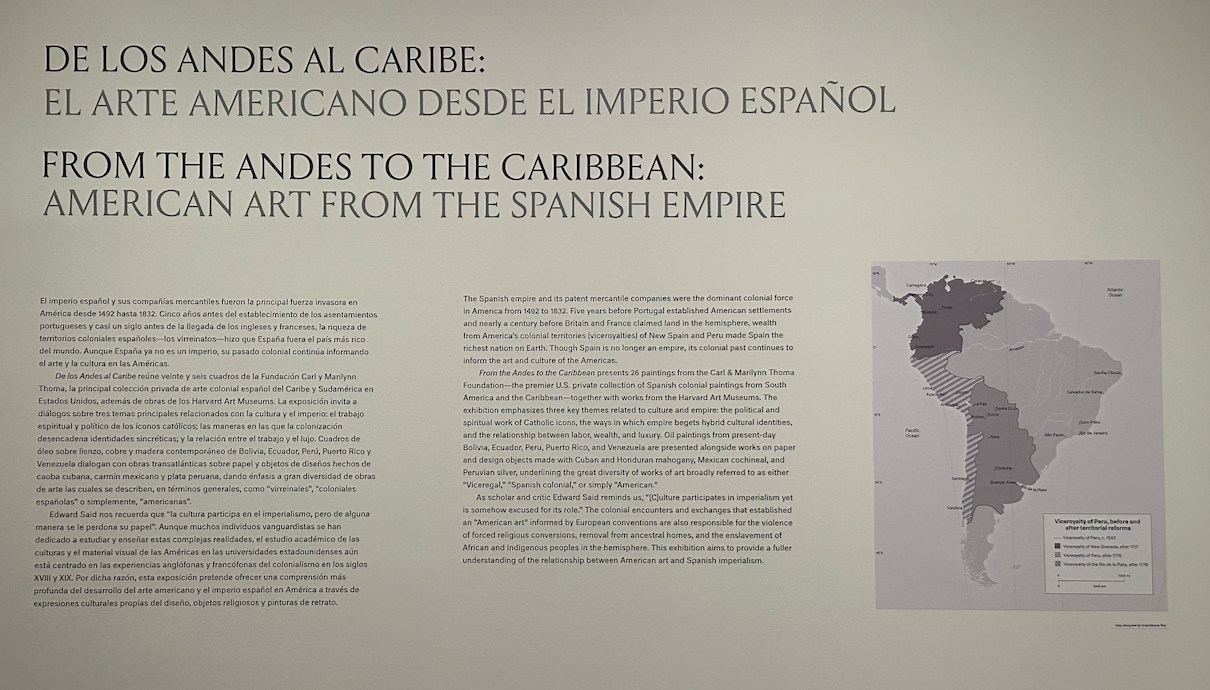
Although many of the ReFrame objects are single objects, there are a few throughout the museum that highlight entire galleries (“New Images of Humankind,” for example). I think a potential missed opportunity within the ReFrame project is the chance to highlight the special exhibits through a ReFrame lens as well. Many of the special exhibits in the museum uphold “difficult histories, investigate untold narratives, and experiment with different approaches to storytelling,” but they are not necessarily highlighted with the frame. If I were visiting the museum and intrigued by the ReFrame labels specifically, this might lead me to miss out on some larger conversations within the museum. For example, a new exhibit just opened: “De Los Andes Al Caribe,” and the curator aimed, through the exhibit, to signal a shift in ways that American art is discussed at the museum–away from an art of region and toward an art of hemispheric understanding. One way that they aimed to do this is to orient visitors in the room to think about how we define “America” versus “Americas.” The exhibit is unique, at least in H/AM, with multilingual chat labels, further uplifting a shift in ways that we think about the artists of the Americas by including first the language of the artist, then the English label to follow (if it is not the native language of the artist). All of this to say, this special exhibit considers many layers of institutional questioning that align with the objective of the ReFrame label, but is not noted as such. I do wonder if a ReFrame label would ask more visitors to consider the exhibit through a new lens or approach, though I think the gallery and chat labels do a lot of heavy lifting when it comes to upholding questions of cultures seen and unseen.
-
ReFrame
Existing ReFrame Sign
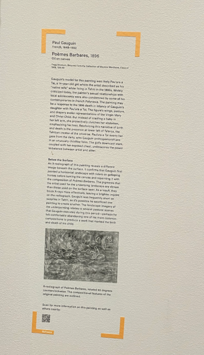
I thought this ReFrame sign for Paul Gauguin’s painting “Poèmes Barbares” works well. The description highlights the controversy surrounding Gauguin’s sexual relationships with adolescents in Tahiti in the 1890s. The ReFrame sign not only explores the painting from a historical standpoint, but also incorporates a perspective from a contemporary point of view. This helps the viewer think more critically about the painting, making them wonder more deeply about things such as power imbalances, gender roles, and so forth. The painting therefore transcends being just “oil on canvas”. It is instead a dynamic work that can act as a starting point for having difficult conversations that continue to exist in today’s society. The ReFrame sign also highlights further research on the artwork, emphasizing an x-ray of the painting which helps in expanding our understanding of the painting, or approaching it from a new lens. The x-ray reveals that the artist’s initial intentions for the painting (a landscape) were actually very different from what he ended up deciding to paint. These layers of past paintings and erasures are made visible to the museum visitor through the ReFrame sign. This makes the viewer wonder: Why did the artist decide to paint this subject as opposed to his initial intentions? What does this say about the value he placed on the subject of this painting? Does this information change our interpretation and perception of the piece? The ReFrame further encourages us to delve further into this painting by scanning a QR code which leads us to further research on the piece.

New ReFrame Concept
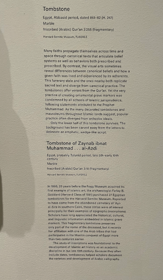
These objects are various tombstones from Egypt and Iran through various periods (Seljuk period, Abbasid period, Tulunid period). The descriptions of these objects explore these remnants of tombstones and give the viewer a bit of overview and context. We are told how one inscription translates to the “soul’s entry to eternal life”, and another tombstone of an individual “records her affiliation with one of the Arab tribes that had participated in the Muslim conquest of Egypt”. However, the descriptions mainly seem to focus on the development of Arabic calligraphy as an academic discipline. The visitor also comes to learn that these tombstones were part of 27 Egyptian tombstones that were purchased by a Harvard archaeologist in 1890 from a cemetery in southern Cairo. I feel that there seems to be a tension between the significance and importance of these tombstones in a religious and cultural context, and the way the description seems to take a more scholarly/academic perspective. The description seems to acknowledge that these tombstones are religiously significant, but we mainly read a more surface-level analysis of the tombstone. These tombstones are markers of a community, spirituality, and cultural heritage, and are taken and preserved by scholars from the Western world. To what extent are we valuing academic research from a euro-centric perspective over the cultural value that these objects have to the communities they were taken from? I think these artifacts need ReFrame signs to further explore the significance of these tombstones. What was the role of these tombstones in the given religious/cultural context? What is the meaning of death in these contexts? The ReFrame design prototype below helps to explore these ideas further by adding religious, cultural, and historical context.
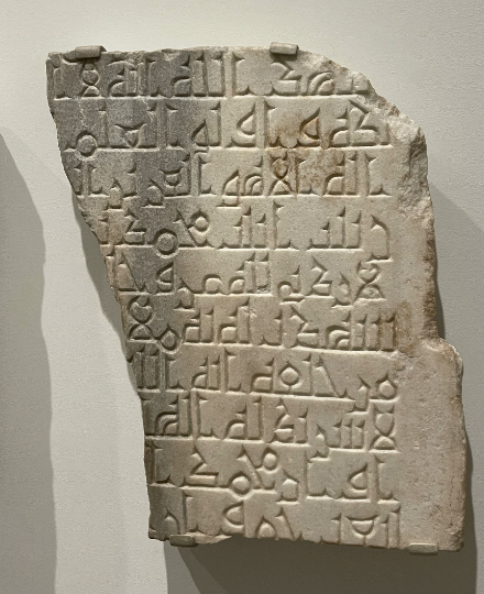
Link to new ReFrame (the text is just placeholder text from google): https://www.figma.com/proto/2cgehJpVOcc4DvKkBGU9mI/Untitled?node-id=7%3A15&scaling=scale-down&page-id=0%3A1&starting-point-node-id=7%3A15
-
Harvard Art Museums - ReFrame Discussion - RB, JL, TL, AN
For this sphinx object and label with ReFrame, it’s compelling that at least the conversation is being opened up: there is acknowledgement of people’s tombs having needed to be disturbed in order to present this object, and there is acknowledgement that the history and proper path forward can get murky. With the objective of creating community around objects, this ReFrame does open up the conversation. The QR code is interesting because it invites people to leave their thoughts; upon exploring, it leads to a one-directional, opaque Qualtrics survey. You type in your thoughts in a long-response text box and you’re not able to access your response after you submit nor see other people’s responses. In the spirit of creating community, might there be other ways to have the discussion more broadly and openly regarding how to display these funerary objects? The questions from our class discussions continue to linger: does acknowledgement of being “removed from its tomb… at an unknown date” satisfy our current needs for (more) ethical museum practices? What might the alternative(s) be? Something better, or nothing at all?
–

For this mirror object, descriptive label/text, and ReFrame, the objective of the ReFrame seems to shift. It’s not posing direct questions, although it is presenting information that may not be traditionally found in labels and art-accompanying texts. Instead of looking on the cultural and social impacts of the object like the sphinx, this framing comes from a scientific and material research standpoint. Perhaps, demonstrating how objects like this are of use in current study. The text: “because they were not scientifically excavated, it’s difficult…” seems to almost beckon a question — parallel to the sphinx object covered above, what is the history? How was it excavated, who did it, how is it here now? We only know that it comes from tombs, but much other information is missing. Instead of telling more about the cracks and fissures and the radiopacity of various materials, it would be helpful to give reasons why the x-ray was used in the first place, and what information can be revealed about the object’s history from the x-ray. Connecting these themes to the sphinx could be an interesting way of creating community and conversation around these two seemingly distinct pieces. How could technology be utilized in this ReFrame? For communicating more of the timeline? For allowing exploration of the x-ray techniques used to examine? For connecting this art with other objects from tombs or having similar repair/concealment techniques? Or is it fine as it?
–

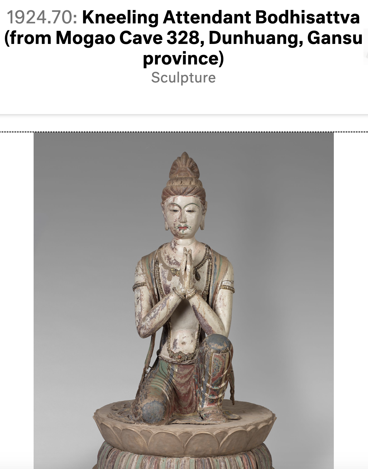
For the Bodhisattva object and Buddhism text, this could be an opportunity for a meaningful ReFrame. What’s the history of how this object came from a cave in 7th century China to the 20th century Sackler collection? The object text describes the possible process of making and the meanings behind the object in its original setting; it is almost inviting the question: so what is its purpose here? What is it doing here? For the larger Buddhism text, it currently focuses on the history of Buddhism and some general understanding of its history; perhaps a ReFrame could focus on how it’s impacting life today. With community making as a theme of ReFrame, how can discussions be facilitated around the current ubiquity of ideas such as mindfulness, spiritual centering, etc. and how those were informed by Buddhist practice and are there possible relationships that objects such as the Bodhisattva could have with that? Possible technology inclusions could be examining the Bodhisattva object within its original context: with the other 7 figures it was originally around for its original purpose.
-
Harvard Art Museum Reframe
Nude in a landscape
 ![545601678857350_.pic.jpg]
While at first sight, without having read the Reframe narratives, this painting looks bizarre with a naked woman standing amongst trees. Yet it is interesting how the narrative provides clueless viewers with so much useful information using limited number of words. The narrative mentions many different aspects, including the intentional choice of the natural setting, the common European stereotypical views of women, the influence on the painter through his travels, and the specific choice of painting material. This narrative triggers my interest in exploring other relevant works, such as other paintings with nudity theme by Otto Miller and also other contemporary paintings that reflect Europeans’ depictions of women. It also encourages me to think critically. For instance, the narrative mentions that this motif “relies on the European stereotype” of women’s body as objects of erotization, so I’m wondering whether this painting intended to support this stereotypical view or challenge it from the perspective of the painter.
One thing I think that could be improved potentially is the structure of the narrative. I noticed that it basically has four main points, and either separating those points into subparagraphs or listing them with bullet points would help viewers better locate information that they are interested in. For instance, if someone is conducting a research simply on the materials used for the painting, it would be nice to have a section with title “Use Of Distemper” for the viewers to quickly and conveniently find what they are looking for. Another thing for improvement is that while there is a word limit on the narrative, there could be qr code linking to a more sophisticated and complete narrative for viewers eager to explore further and more in depth. The qr code could also guide viewers to other similar paintings by Otto Miller or depicting the same theme.
Additionally, it could be mentioned as well that this painting is an excellent example of the Art Nouveau movement, which is a movement emphasizing the beauty of nature and the female form. The narrative could also remind the viewers that the painting can be interpreted in various ways. For instance, while some may see it as a celebration of the female form and nature, others may view it as objectifying or even pornographic.
“Degenerate Art at Harvard”

This narrative helps viewers to understand the connections between the two paintings and fully appreciate the value of them. The narrative mentions that for Americans, they might not have had a lot of previous exposure to German art, especially those gated by Hitler. Therefore, this narrative helps viewers acknowledge the contexts of the paintings and their value in helping to reshape people’s general views on German modern art. It is also very helpful that the narrative provides a link at the very end, guiding viewers to further explore the process of artifact collection for Harvard Art Museum.
However, the text for this label is very dense, and while it is hard to condense entire historical narratives into two paragraphs, I wonder how many visitors would take the time to read the entire description. One idea for improvement could be to break up the text into multiple sections for readability. In general I noticed that the font size of the labels at the Harvard Art Museum tends to be on the smaller side, compared to other museums I’ve visited, and I wonder if space permits, if it would be possible to format the descriptions such that it might be easier for visitors to grasp key concepts just by scanning through the label. In terms of the label’s content, I was left wondering if there are specific subject matters or artistic styles that the Nazi Party targeted, beyond the quote that the description provides. The first paragraph could clarify what exactly characterizes “degenerate art,” if there is anything beyond the fact that these artists and works were banned by the Nazis. I think this could be useful information in guiding the connections that visitors draw as they view the art in the exhibit.
Reframe Death with Left Hand Raised:
https://harvardartmuseums.org/collections/object/222835?position=7

“Death with Left Hand Raised” is a sculpture that has become an enduring symbol of death personified as a skeletal figure with its left arm raised in a gesture of finality or warning. The origins of this iconography can be traced back to the late Middle Ages and Renaissance period in Europe, where the “dance of death” became a popular artistic theme. In these works of art, death was depicted leading people from all walks of life in a macabre dance to their ultimate demise, emphasizing the idea of death as the great equalizer. The sculpture of “Death with Left Hand Raised” continued this tradition by reminding viewers of their own mortality and the fleeting nature of life. The raised left arm of the skeletal figure serves as a warning to viewers, urging them to live each day to the fullest and to prepare for the inevitable end. Some examples of this sculpture, such as the woodcut by Hans Holbein the Younger, also incorporate other allegorical figures to emphasize the idea that death comes for all people, regardless of their status in life. Overall, the “Death with Left Hand Raised” sculpture serves as a powerful symbol of the transience of life and the need to live a virtuous life in preparation for the inevitable end. Its message has resonated throughout history and continues to inspire contemplation and reflection on the nature of mortality.
-
Contextualizing (possibly) stolen art at the MFA
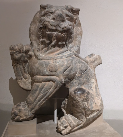
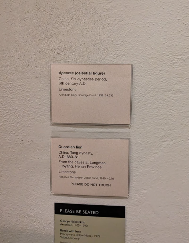
When we were walking around the ancient world exhibits, we noticed that the descriptions for many of the pieces in the ancient Chinese art exhibit were relatively sparse. Many of the names under the exhibits were white-sounding, and we were curious about how these items had gotten to where they are now from their original historical places.
Consider the Guardian Lion statue from Longmen, China. The description is very brief, and mentions that the piece was donated by the Rebecca Richardson Joslin fund. Looking a bit into her history we actually found out that Joslin was an MIT alumni, but there was little information about how the fund had even come to “own” the piece.
We ended up doing some more research and found this article on how Chinese artifacts typically got to the US. In fact, many of the artifacts from Longmen seem to have been plundered from the buddhist sanctuary at Longmen Grotto in the early 20th century because of interest from Western collectors. Eventually these ended up in the hands of C.T. Loo, a sketchy art dealer famous for illegally exporting significant cultural relics out of China. Likely these artifacts were sold to wealthy families and possibly changed hands a few times before ending up at the Joslin fund.
The history of this piece’s acquisition is quite interesting but it seems like the MFA hasn’t really done it justice. This might be partly because admitting the shaky ethical grounds behind the ownership of the artwork makes it hard to justify displaying (what amounts to) cultural theft. But if that’s the case then by just ignoring the situation we feel like the MFA is just shirking a hefty moral responsibility.
-
Museum of Fine Arts: Contextualization
Exhibit: SMFA @ Tufts Archive & Autobiography
Exhibit
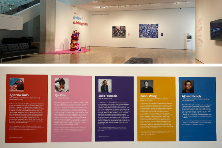
Context of Exhibit
Contextualization Thoughts
- Thought that the exhibit was rather well contextualized, it consisted of 5 pieces that were unique to the artist’s background and they had interesting backstory in the description of the pieces
- Each artist had their own “Color that corresponded with their piece”
- The exhibit itself was also well described (See description below)
- Made me think about the third person and the formal tone about captions
- The exhibit pieces themselves are rather personal and all relate to the thoughts and emotions of the artists, but the formal captions only really introduces how the artists came to create their work while lacking a close connection to the artists as human beings
- When an exhibit is about personal experiences, how can one write in a way that may be more relatable
- Who are they speaking to? to the general public, to the critics, ect
- The layout of the exhibit posed a challenge: it was difficult for us to realize the initial context of the exhibit when we saw the pieces
- may have also had to do with the idea that the exhibit had multiple (~¾) entrances
- The biography of the artists were hidden from view at first since it is on the wall right next to the entrance we went through
Development of a new concept:
- The labels feature a good-sized font and an acceptable length.
- Include short sections in the label text to feature the artists’ own voices to initiate a deeper conversation with the visitors
- Technology is not employed. This isn’t necessarily a bad thing, but narrating a story is one effective use of technology in this area.
- Audio from the artists themselves would be a nice addition
- Perhaps the addition of audio will create an emotional experience as the audio will narrate the background of the artwork, its creation process, and the artist’s inspiration. It will bring humanness to the artwork.
- Would still keep the color coding as it carries an emotional depth and content
Contextualization of Pieces
- Thought that the exhibit was rather well contextualized, it consisted of 5 pieces that were unique to the artist’s background and they had interesting backstory in the description of the pieces
-
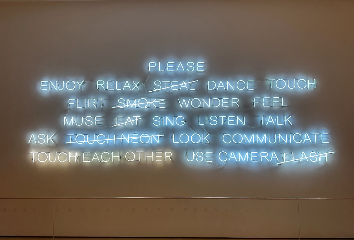
Contextualizing the MFA
In viewing Jeppe Hein’s “PLEASE…,” we were left wanting to know more. The chat label describes how the piece considers “how public opinion about acceptable and non-acceptable behavior changes over time, and depends on context’ (Hein, 2008). We would’ve appreciated further context and information: has this piece changed over time? Across context? A simple search of the artwork reveals that it has been in exhibitions across the world, so has the piece changed to adhere to the social norms of where it is exhibited?
To redesign the display to include this, we suggest a simple QR code with further information be added. The code could lead to the history of the piece. It could also lead to an interactive activity: what else could or should be added to the piece as acceptable or non-acceptable behavior? Is there anything that isn’t crossed out that visitors to the museum think should be?
After scanning the QR code, viewers will be taken to a page where they can get an overview of the artwork, as well as learn more about the artist and other related works. This helps the viewer in getting a better understanding and sense of the artist’s intentions. It is interesting to note that the artist (on his website) mentioned that this piece was a critique on museum guidelines/behaviors, whereas this significant detail seems to have been omitted through the curatorial process at the MFA. This makes us wonder the extent to which an artist’s intentions may be diluted and skewed through curation. In addition, this particular artwork relies heavily on “public opinion” and can even be thought of as a participatory artwork. However, it seems difficult to actually engage with it and visitors are instead passively viewing it. The “audience” section of the prototype aims to create more active engagement by encouraging them to comment and think more deeply about the work.
Prototype Link: https://www.figma.com/proto/NONB4TqMpukE1ivU8AwhvW/Untitled?node-id=1%3A3&scaling=scale-down&page-id=0%3A1&starting-point-node-id=1%3A3
-
Turning the MIT Museum Inside Out
A description of the issue/problem that you are trying to address
- Are MIT students who are currently visiting the MIT Museum getting/learning/leaving with the purpose of the museum: to “turn MIT inside out” and make MIT’s work more accessible and visible to the world?
- Potential addressing of this could be using AR to help embody an experience — development, production, etc. of a project — to enable the visitor to visualize being part of the process / being part of MIT.
- How about the visitors who are not affiliated with MIT? When they leave the museum do they gain a better understanding of what MIT is or embodies?
- Driven and inspired by some of our readings and conversations around participatory engagement in museums–how can we utilize AR (or another digital technology) to realize MIT Museum’s purpose of making MIT’s work accessible and visible?
- Like other museums, MIT Museum might have a lot more artifacts currently not on display. Could we use AR or some digital catalog to make those more visible to those who wants to learn more?
- If AR is used purposefully to enhance the museum experience for MIT students, then they will learn more deeply about the chosen exhibit, so that MIT’s work displayed in the museum becomes more accessible and visible to its current students.
- AR can potentially make any interaction or participation less intimidating since everyone will have their own devices to work with(as opposed to the lascaux interactive exhibit discussed in class)
The envisioned audience for your project
- Current (and future) MIT students (or potentially outside visitors)
Potential museum collaborators (currently MFA; Harvard Art Museums, MIT-Museum, and others are possible as well)
- MIT Museum
Technological/spatial/installation approach (if part of the project)
- AR- Embodied experience
- Participation/engagement
Skill sets needed for your project
- AR coding
- Research / statistics
- Educational / pedagogical
-
Think Human!
The problem: Oral cancer has a 5-year survival rate of 86.3% for early stages or localized disease according to the surveillance epidemiology and end results (SEER). However, the 5-year survival rate drops to 69.0 and 40.4% for late stages (i.e: stages III and IV). Most patients (72.2%) present at later stages according to SEER. Routine screening for oral cancer then merits attention.
Dentists and primary healthcare physicians (PHCPs) can help with opportunistic screening. However, this requires a behavioral change as well as the implementation of the 5-minute head and neck exam into practice.
The audience and their behavior: The traditional methods of encouraging them to incorporate the 5-minute exam have yielded no discernible results. They, however, value aesthetics and art; so I thought a museum experience would be a great starting point to establish and mirror this connection.
Technological/spatial/installation approach: I propose a virtual, immersive experience with four multilayered approaches: (1) introduction to the art world and art history, (2) meaning-making of the artwork, (3) knowledge production related to making inferences that depict signs and symptoms and social conditions of diseases, and (4) eliciting behavioral change insofar as it gives dentists the impetus to incorporate the 5-minute head and neck exam. At the end of the experience, I’d like to include a virtual reality station to demonstrate how the head and neck exam can be performed, addressing one of the barriers that prevent general dentists from performing the exam.
Potential museum collaborators: MFA offers a wide variety of paintings that can be used to learn about art and also function as a good storytelling medium to discuss medical conditions. The VR experience can be found at the MIT museum.
Skill sets needed: curation, pedagogical structuring, programming skills, and VR-related experience.
Reference: National Cancer Institute: The Surveillance Epidemiology and End Results. Cancer Stat Facts: Oral Cavity and Pharynx Cancer.; 2022
-
Project Idea-User analytics
User analytics Project Proposal:
Summary
Currently, one of the most discussed museum artifacts is curation, and the conversation usually centers around how to make the experience enjoyable for users and profitable for musuems. In order to effectively evaluate the impact of their curation efforts, as well as the overall selling features of the museum, museums currently rely on user surveys. However, these methods can introduce bias and provide inaccurate results. As a result, there is room for substantial improvement on understanding and effectively monetizing museum visitors. However, many systems currently in existence provide concerns about user privacy, data collection, and legal compliance. To this end, we propose the installation of cheap $5-$10 dollar cameras that track and process user data on board such that there is no concern of data other than batched user analytics leaving the device.
We propose a system that allows museums to track where their visitors spend the most time, interpret emotional feedback, and gather analytics on visitor flow to optimize the presentation. To implement this system, we suggest a network of cost-effective cameras along with other required sensors that maintain user-privacy by anonymizing and performing computations entirely on chip.
We believe that with this series of attributes, the data collection framework has the potential to be compliant with user privacy laws, unitrusive to guests, and enable museums to effectively achieve their missions.
The envisioned audience for your project: Musuem curation teams as well as marketing teams; this is intended to help them more acturately gauge their audiences tastes.
Potential museum collaborators: MFA; Harvard Art Museums, MIT-Museum, a ideal location would probably be a sub exhibit of the MIT musuem.
Technological/spatial/installation approach: For trials, it is possible to make the entire system relatively pain-free to install; it would probably just consist of placing cameras in locations across the installation to be observed, and plugging them in.
Skill sets needed for your project:
TinyML experience, data analyst, some lightweight hardware design, and legal consul to show compliance with local data privacy laws.
-
Project Idea - Color Scanner
A description of the issue/problem that you are trying to address One idea I have is an app that allows you to scan colors found in artworks / the world. With the color swatches, the app will generate color palettes or you can create your own. This will allow people to engage with artworks beyond just traditional methods and help people with their creations after they get inspired at museums.
The envisioned audience for your project Artists: Artists will be able to save colors they like in the world, see how they would look together, and then export these color palettes for use in digital art softwares. Kids: The app will give kids a new way to interact with art. There could be challenges, such as, find the colors of a giraffe and draw one, or find all the colors of the rainbow, or see how many shades of pink you can find.
Potential museum collaborators (currently MFA; Harvard Art Museums, MIT-Museum, and others are possible as well) Any museum with a vast collection of artwork could be a potential museum collaborator; the MFA or Harvard Art Museum could work well.
Technological/spatial/installation approach (if part of the project) The app will allow you to scan colors in works of art and then provide color palettes from those swatches or will let the user create their own color palette. The user can either find certain colors as part of a challenge or simply find colors they love. The user can then either create small works of art within the app using those colors or export those colors to a separate digital art platform.
Skill sets needed for your project UI/UX design, knowledge of design and color theory, possibly coding
-
Final Project Idea
Augmented Reality for Architectural Experience: A description of the issue/problem that you are trying to address: Many museums have architectural elements that are not easily accessible or visible to the public. This can make it difficult for visitors to fully appreciate, respect, and understand the significance of the architectural aspects in relation to the collections on display. Additionally, traditional methods of interpreting architecture, such as audio guides or placards, may not provide a fully immersive and engaging experience for visitors. The central concept is to allow the visitors to virtually experience the architectural components in the display to better understand the historical, and cultural context, as well as the collections themselves.
The envisioned audience for your project: The primary audience for this exhibition would be museum visitors interested in architecture, design, and technology. This may include students, architects, historians, and museum-goers of all ages.
Potential museum collaborators: The Museum of Fine Arts, Boston (MFA), MIT Museum, and the Harvard Art Museums could be potential collaborators for this exhibition. They both have collections that include architectural elements, and they also have a history of collaborating on exhibitions. Technological/spatial/installation approach: The exhibition would utilize augmented reality (AR) technology to enhance the visitor experience of the museum’s architecture. Visitors would be able to use their smartphones or other AR devices to see virtual 3D models of architectural elements: objects including columns, arches, and ceilings, overlaid on the real-world space. The AR models could include interactive features, such as animations, audio, and text descriptions, providing visitors with a deeper understanding of the significance of the architectural elements. I want the exhibition to be designed as a self-guided experience, allowing visitors to explore the museum’s architecture at their own pace. The AR models would be triggered by markers placed throughout the museum at locations close to the collections, such as on walls, floors, or ceilings. The exhibition would also include physical installations, such as displays or models, to provide visitors with a tactile understanding of the architectural elements. Skill sets needed for your project: Augmented reality: This would involve creating 3D models of the architectural elements, programming the AR app, and integrating interactive features. Architectural interpretation and visualization: This would involve researching the architectural elements included in the exhibition, developing text descriptions, and audio scripts, and creating architectural models for the physical installations. Exhibition design: This would involve designing the physical installations, creating the layout for the markers, and ensuring that the exhibition is accessible and easy to navigate.
-
digital displays and integrated physical interactions
A description of the issue/problem that you are trying to address
- Many museums are moving towards a digital display approach where visitors interact with screens that can show a huge variety of information. However, this experience can be widely easily repeated on a laptop, so how can exhibits distinguish their digital displays from this. One approach is to simply have larger screens (ie: projection, theater style settings, LED displays) but that is a flat 2d experience. Additionally, if this breaks down, there is a large obstruction in the exhibit that offers no additional value for the visitor.
- How do we integrate technology into exhibits in a way that can add value, but if taken offline, does not actively subtract from the experience?
- Hardware integration into museums that are nonspecific (ie: can be modular and adapted in many ways to different exhibits that has the same flexibility that screens will have)
- How can we keep physical engagement in the center of a museum’s experience
- References:
- Science Museum, London. Wonderlab: The Equinor Gallery.
- Has a series of integrated science exhibits that can appeal to both adults and children. Displays with a highly technological backing that demonstrates core concepts in the physical world
- Mirrors, LED, massive human scale turntables with the solar system, friction slides, and other builds
- MIT Museum, Terraform display (The one with blocks and sand, with a projection)
- Lascaux IV Remaking and displaying the caves with current technology, allowing people to touch extracted models from the cave
- Tactile (or even textile) sensing and actuation technology from CDFG in CSAIL
The envisioned audience for your project
First time and repeat museum visitors Accessibility target- interacting with new technology in ways other than screens
Potential museum collaborators (currently MFA; Harvard Art Museums, MIT-Museum, and others are possible as well)
MIT museum (as a starting point), moving into future exhibition designs
Technological/spatial/installation approach (if part of the project)
A technological demonstration of modular displays or supporting technology to current exhibitions
Skill sets needed for your project
Curation, pedagogical design, hardware and workshopping/prototyping
-
aouyang-project-update
aouyang-project-update
Problem Despite the crypto winter as the result of certain disruptive events in the space, there is still a market for digital assets, specificially NFTs, and the question of how to integrate these into our existing cultural institutions remains. Furthermore, given the environmental impact of NFTs, there is another question of how to responsibly create digital assets with this in mind. With more museums launching “official NFTs”, I would like to propose a service that partners with museums to streamline this process with the following points addressed:
- A carbon-neutral platform where the carbon footprint of the NFT must be offset by carbon credits. The collector has the responsibility to also buy the carbon credits when acquiring an NFT.
- Currently most NFTs are just separate entities lacking curation and structure. Develop a protocol to enable curation by theme.
- Signatures with museums certifying the “official”-ness of a minted NFT based on existing work
- Exploration into pure NFTs without a physical counterpart as an augmentation of the museum collection
Envisioned Audience Collectors of digital assets, museums, environmental-conscious crypto enthusiasts.
Potential Museum Collaborators MFA, ICA, MIT Museum, smaller local museums
Approach Partner with one museum to begin with and create a minimum viable product that addresses the most important problem of carbon neutrality and signatures.
Skill set web3 dev, web2 dev, marketing
-
AI Based Collection Map
A description of the issue/problem that you are trying to address Museums have a vast collection, much of which is never seen by the general public. Most people don’t know anything about the collection, and often the collection is so large it is hard to comprehend the scope of it. I propose a solution that allows both curators and visitors to explore the entire collection, as plotted in 2D space. This would catalog various features of the work, and then use GPT3 to create embeddings of each work, that can then be reduced to two dimensions and seen visually. You would be able to see clusters of works, and see how all of the works in the collection relate to each other. You can also explore the collection over time, and see this map for different time periods of the exhibition. It could also show when various works were on display, if ever.
The envisioned audience for your project Museum Curators - use the tool to look for “gaps” in the collection (what else should be collected), or parts of the collection that have been underused. This can be used to design new exhibitions or make new connections between various works.
Museum Visitors - this can also be used as a visualization tool for the general public - they can zoom in and out of the collection, and see how it expands over time. This is a great first step at making the scope and scale of the collection accessible to the public.
Potential museum collaborators (currently MFA; Harvard Art Museums, MIT-Museum, and others are possible as well) Harvard already has a fantastic API that has information about all of the works in their collections. This would make the project vastly easier if the museum already has an API that can be used to query into the collection.
Technological/spatial/installation approach (if part of the project) Use GPT-3 to create embeddings for all of the works Dimensions reduce this embedding to two dimensions Plot all of the data in two dimensions, and use GPT-3 to create labels for each “section” of the map automatically Create timeline and search features for the map
Skill sets needed for your project AI Coding (using GPT3 api) Data analysis (what features of the works do we want to focus on) Data visualization (React, D3, js)
-
Project Update Anugrah
Problem/Issue being addressed
When walking through the AI exhibit at the MIT museum I was quite unconvinced that it could substantively educate people about how modern AI works. The parts that I connected with most were the gigantic physical machines and not the small AI writeups. I think part of the issue lies in novelty - now that ChatGPT exists and is so easy to use, interactive displays (like the poem writing one) don’t actually add anything meaningful that you couldn’t just accomplish at home.
However I think it is quite possible to create a more informative addition to the AI exhibit that explains the rough methods behind the high level ideas in modern machine learning/AI instead of just explaining the high level ideas so quickly that the viewer just gets lost.
Envisioned audience
The intended audience for such an exhibit would probably be an adult or a highschool student. I think having some rough background in what modern technology looks like would be helpful, and I don’t know if someone too much younger could take much away in terms of the high level details.
Potential museum collaborators
I think a project along these lines would really only work at someplace like the MIT museum. Throughout its history, MIT has been pretty tightly connected to the growth of technology, and I think such additions would fit naturally into the AI exhibit.
Technological/spatial approach
I think the ideal presentation of this project would probably be something like 2 smaller informative demos with sparse text that visualize what a neural network is, and how they can be applied to images (i.e. adding in a few things like convolutions on images). Then we could have a cutting edge demo that shows some piece of technology that has been big on the internet in the recent few months and rotates every once in a while. For example, given the current internet interest about image generation models like DALL-E, we could have an interactive demo that somehow works in real-time e.g. a local server that hosts a StableDiffusion model and allows people to play around with different parameters.
Skill sets needed
Primarily this sub-exhibit would require knowledge of modern machine learning, some UI/UX design for creating the actual interfaces, and some basic web scripting experience.
-
project ideas Livia
Introducing meditation in to the museum experience. Would be really useful as an educational factor or ease transfer of environments.
Several problems that I’m thinking about:
- Traditional meditation has been greatly condensed in its westernized version, so most people in the US only know an extremely small portion of what it has to offer.
- It is not easy to create an intentional space for meditation, especially in a world that is progressing faster than the individual can run.
-
There exists a stigma on meditation, when it in fact has already been developed for all sorts of cognitive fingerprints throughout its extended history.
In particular to museums:
- There seems to be difficulty in effectively transitioning between different exhibits for visitors- for example, with the photography exhibit in the MIT museum, wandering around an interactive, shiny environment and suddenly being inserted into a quiet place where people can ponder can be disorienting at first. “Meditation,” in both a traditional and non-traditional sense, can be used as a method to reorient and prepare a visitor for the next experience.
- Entering from said speedy world to a museum, where some participants may be expected to maintain some sort of ettiquite / behavior, may be easier for those who undergo a few seconds/minutes of transition.
- It would be interesting if visitors could experience what those at the CPL (the photography lab??) did from their spiritual inspirations.
- Not only can it help with transitioning from a chaotic to a more calm state, but it can also help visitors transition from calm to an energetic state of mind. Creating a certain state of mind can greatly increase the experience, and help curators/designers create exhibits with a certain audience’s state in mind, in mind.
Audience: all visitors in a museum. Curators/exhibit designers who are interested in a more controlled audience to design for. Probably better designed for relatively older audiences, though.
Potential museum collaborators: MFA, Harvard, MIT museum, etc.
Approach: The hanging black box on the second floor of the MIT Museum is inspirational. When I stood under it, it felt like I was in a different space for a bit. A potential approach would be to have the hanging black box, and introduce different experiences for different senses with it. First, using spatial sound when visitors under it. Then, at the top of the black box, attach an incense that would start. While all of this is happening, having a set of instructions / educational on meditation playing through the spatial sound. There are different meditations to explore, depending on what curators may want. Some for grounding, others for energizing, focusing, sparking curiosity/awareness. Having options with eyes open or closed, breathing shallowly, deeply, long, short, or “catching” sounds. Each its own effect, and each something new to the typical person.
Otherwise, encourage meditative practices in that one big stairwell with a bunch of seats with the large TV. It’s literally such a good place for meditation already… I wonder what else it’s used for other than presentations…? It has a lot of potential for something like this, especially in transition to the kinetic machines and AI section that it leads up to.
Skills: Designers/UX Mechanical Engineers/Peeps who can make a box Programmers/Electrical Engineers Someone with lots of meditation knowledge (I count)
Or, just UI/UX + meditation knowledge to create a program for the big screen idea
-
Project Brainstorming (Lamees)
Project Idea - Open dialogue between all members of a museum community
Issue being addressed:
One of the issues I am interested to explore is the sense of hierarchy that is often created between the curator and visitor. I am curious about ways in which this distance can be reduced by having a more active and open dialogue between visitors and museum professionals. This distance also exists not only between the curator and visitor, but also between the curator and the artist/scientist/collaborator/etc for the exhibition being created. As we heard from Gary Van Zante of the MIT museum, there is often a sense of dilution that occurs in the process of crafting an exhibition. This is an issue that I have also encountered at the ICA, where it is often difficult to be able to convey an artist’s voice and vision in the purest way possible while also trying to balance this with the curator’s voice. I wonder how much of a collaborator’s voice is often lost within exhibitions. I want to create a platform that encourages transparency and creates a more open dialogue between visitors, artists/scientists/etc, and curators/museum professionals. I want to focus on reducing the sense of distance and dilution that is created within the process of putting together exhibitions by having a platform which allows museum collaborators like artists and scientists to share their voice directly with visitors, while also allowing visitors to interact and engage with each other’s opinions to foster a sense of community. Overall, I want to create a stronger sense of transparency and active dialogue between all members of a museum community.
Envisioned audience:
The envisioned audience includes all members of a museum community. The platform I am envisioning will encourage open discussion between curators, collaborators, and visitors. I am also thinking about ways in which conversations can be streamlined to make the experience as meaningful as possible to all demographics. For instance, having a separate section within an application for children to engage in conversation with other children about their interpretations of an artwork/artifact/exhibit/etc within a museum.
Potential Museum Collaborators:
I am interested in collaborating with the ICA. The “contemporary” nature of the museum means that the focus is more on the present than the past. I think that this doesn’t only apply to the kinds of works being presented and exhibited, but also within their approach to crafting museum experiences. I think that the ICA is also of interest to me because they work on reducing the sense of distance between collaborator and curator by providing “innovative experiential learning opportunities for people of all ages through direct encounters with artists and art-making” (as stated in their mission statement). It will also be accessible for me to conduct research with the ICA as I already work there.
Technological approach:
I am interested in prototyping a mobile app that will serve as a platform for more open discussion between all members of a museum community. This platform will allow collaborators to engage directly with artists, curators, as well as other visitors. For instance, users will be able to select one of the artifacts they are viewing, view supplemental media directly from the artist or collaborator of that artifact, read other visitor’s comments and interpretations, and also make their own comments. This will encourage a more deeper engagement with exhibits, while also allowing visitors to learn from a multitude of perspectives and expand their mindsets.
Skill Set:
The skills needed for this project are mainly design, prototyping, and knowledge of UI/UX processes (conducting user research, creating wireframes, low/high fidelity prototypes, etc).
-
Initial Museum Ideas
Augmented Reality for Architectural Experience: A description of the issue/problem that you are trying to address: Many museums have architectural elements that are not easily accessible or visible to the public. This can make it difficult for visitors to fully appreciate and understand the significance of the architecture in relation to the collections on display. Additionally, traditional methods of interpreting architecture, such as audio guides or placards, may not provide a fully immersive and engaging experience for visitors. The central concept is to allow the visitors to virtually experience the architectural components in the display to better understand the historical, and cultural context, as well as the collections themselves.
The envisioned audience for your project: The primary audience for this exhibition would be museum visitors interested in architecture, design, and technology. This may include students, architects, historians, and museum-goers of all ages.
Potential museum collaborators: The Museum of Fine Arts, Boston (MFA), MIT Museum, and the Harvard Art Museums could be potential collaborators for this exhibition. They both have collections that include architectural elements, and they also have a history of collaborating on exhibitions.
Technological/spatial/installation approach: The exhibition would utilize augmented reality (AR) technology to enhance the visitor experience of the museum’s architecture. Visitors would be able to use their smartphones or other AR-enabled devices to see virtual 3D models of architectural elements, such as columns, arches, and ceilings, overlaid on the real-world space. The AR models could include interactive features, such as animations, audio, and text descriptions, providing visitors with a deeper understanding of the significance of the architectural elements. The exhibition would be designed as a self-guided experience, allowing visitors to explore the museum’s architecture at their own pace. The AR models would be triggered by markers placed throughout the museum at locations close to the collections, such as on walls, floors, or ceilings. The exhibition would also include physical installations, such as displays or models, to provide visitors with a tactile understanding of the architectural elements.
Skill sets needed for your project: Augmented reality: This would involve creating 3D models of the architectural elements, programming the AR app, and integrating interactive features. Architectural interpretation and visualization: This would involve researching the architectural elements included in the exhibition, developing text descriptions, and audio scripts, and creating architectural models for the physical installations. Exhibition design: This would involve designing the physical installations, creating the layout for the markers, and ensuring that the exhibition is accessible and easy to navigate.
Enter text in Markdown. Use the toolbar above, or click the ? button for formatting help.
-
Final Project Idea - Anirudh Rahul
Interactive Art Exhibit
Target Audience: People who are a bit tired of the traditional art exhibit formula of look at image and then read about image, but are excited to actually be able to interact with an art exhibit. The goal of the exhibit is to different perspectives on the art the guests may already be familiar with but also lets them meaningfully change and interact with the art that they are shown.
Potential Implementation: We could implement something similar to whats shown here where we run real-time style transfer to a specific painter’s art style, using a system of cameras or sensors in combination with a projector and or screen. One idea could be to have a camera setup that directly gets fed into a style transfer algorithm, or something more subtle like a projection of the art onto the floor which interacts/morphs as you step through the exhibit via pressure sensors installed on the floor.
Skills Needed: Someone who is interested in integrating sensors/cameras with an interactive exhibit, someone interested in computer vision models(I can cover this part), or just someone generally interested in creating immersive art exhibits
Potential museum collaborators: Harvard art Museum, MIT Museum
-
Final Project Ideas- Yuxin(Candy) Xie
Project Idea 1: Pop up Museums
A description of the issue/problem that you are trying to address:
As we read in this week’s readings, museums sometimes encounter difficulty attracting visitors from diverse communities other than local residents. In order for people from far away also have the opportunity to experience distant museums in person, we could create some easily transportable exhibits that can be displayed in different locations in order to reach a broader spectrum of audiences. The pop up museums should be able to be easily assembled and disassembled using lightweight and reusable materials so that they could easily be transported to different locations.
The envisioned audience for your project:
This project is intentionally to target the typically underrepresented demographic groups among museum visitors, especially people constrained by distance or physical inconvenience.
Potential museum collaborators:
For example, the Museum of Ice Cream that started in New York and has expanded to several other cities worldwide. Also, other such currently existing pop up museums like The Art of Banksy, which is a traveling pop up museum featuring a collection of works by a street artist called Banksy. This pop up museum has also already visited several cities, like Miami, Toronto, and Paris. There are other similar exhibitions we can take inspiration from and consult for advice, such as TeamLab, which allows visitors to interact with colors and lights, and it has attained significant attention and success globally.
Technological/spatial/installation approach (if part of the project):
Since pop up museums usually have only a subset of the whole collection and tend to be limited in space, it is thus more important to make it sufficiently engaging and appealing for the visitors. Because of the limited space, many information about the artworks can instead be put into a mobile app in order to save space. For example, the app could give visitors additional context of the works, some audio tapes about the stories of the artworks and even hear from the creators themselves, and augmented reality features. Modular and reusable set designs would help make the museums easier to assemble and disassemble for transport. We can explore what set of materials best serve this purpose, and we can create walls and displays using interlocking panels for instance. Projection mapping technology can also be used to make the exhibition more immersive for the visitors. Projection can be used to transform surfaces into interactive displays, playing animation and videos to make the entire environment more dynamic. Interactive soundscape can also help to better engage the visitors sensually. The soundscape can be made to specifically fit the theme of the exhibition and recreate a realistic setting, such as an ancient city.
Skill sets needed for your project: The project needs skills related to design, designing the spatial structure of the pop up museum and ways of effectively using the space. The project also needs knowledge regarding material science, deciding upon the materials to be used to facilitate transportation of pop up museums. Also, the project requires some AR/VR knowledge to create immersive settings. The project also needs some UI/UX design experience to create mobile apps.
Project Idea 2: Making Museums More Accessible for People with Disabilities
A description of the issue/problem that you are trying to address:
Museums often lack accessibility for people with disabilities, which can prevent them from fully enjoying the experience. Some common issues might include limited wheelchair access, inaccessible displays, and a lack of sensory experience for those with visual or hearing impairments. So this project can help address these issues to make museums more convenient for people with disabilities.
The envisioned audience for your project:
This project intends to help people with disabilities, including those with mobility issues, visual and hearing impairments, and also cognitive disabilities.
Potential museum collaborators:
We can consult with curators of museums that are currently dedicated to improving accessibility for people with disabilities, such as the Metropolitan Museum of Art and the Smithsonian American Art Museum.
Technological/spatial/installation approach (if part of the project):
We can think about alternative ways of organizing the space in order to make the exhibits and facilities more accessible for people with disabilities. For instance, there could be places with sign language and tactile features. We can have an app with audio guides to provide more description information to people who have visual problems. These audio guides can also be changed to transcripts or sign language for deaf people and those with hearing issues. The museum can also include more sensory experiences, such as touch tours and scent stations.
Skill sets needed for your project:
knowledge about design in order to make the spaces more convenient for people with disabilities app design experience to create supportive tools AR/VR experience to make the sensory experience for visitors more complete.
-
Wunderkammer-tklouie
My Wunderkammer
A selection of items exploring the concept of Home that I’ve picked out from my naturally formed wunderkammer next to my desk: https://docs.google.com/presentation/d/17T3e76RzxPaP-DpTioim8C5SCF3aKDqfFdsg5X4yEf8/edit?usp=sharing
-
Wunderkammer - Amy Ni
This is my wunderkammer about activities I do outside of class and work. It is best viewed in fullscreen presentation mode.
Link: https://docs.google.com/presentation/d/1ZTHcQpAKJgt4AQ-9O04OLBhEAUOP1OG9kpXWAsFpzAw/edit?usp=sharing
-
My Wunderkammer
My Wunderkammer is about dissection of life and examining it through different lenses. To peel back and dissect through the layers of life, one must be intentional and also adventurous. One must examine life closely and from afar. I present to you a collection that represents several layers of the dissection of life through the five senses and their philosophy. It is intended to examine the mundane things we encounter every day through different lenses.
Here is a link to my Wunderkammer: https://www.artsteps.com/view/63f56b49431517534adc01dc
-
My Wunderkammer: Curating Home
https://drive.google.com/file/d/1xCpCQVVUBM_OPGJnRoFnFAxvrf2RbaQC/view?usp=sharing
-
My Relationship with Weight
My Wunderkammer is about my relationship with weight, from the perspecitive of a lightweight rower. Check it out here!
-
My Personal Wunderkammer
Here is my personal Wunderkammer of my life at Wellesley so far!
-
aouyang-wunderkammer
aouyang-wunderkammer
When COVID started in spring 2020, I found myself in isolation at home with few activities to fill my days, looking for something beyond just the monotony of doing psets every day. This led me to explore the humanities and various art forms in greater depth.
Despite the chaos and uncertainty of the pandemic, I discovered a sense of stability and permanence in the arts –– that people from different times and places shared similar aesthetic pursuits, revealing some kind of commonality that transcendeds cultural and temporal boundaries. Furthermore, the way works refer to and build upon one another gives rise to a network of intertextuality that embodies a shared human experience.
Baudelaire’s poem “Correspondences” depicted a synesthetic experience in which sensory perceptions –– colors, sounds, and scents –– become intertwined in the brain. Inspired by the poem’s portrayal of synesthesia, I sought to capture a similar essence of interconnectedness between different art forms through a collection of color palettes named after and inspired by the various works I encountered during the COVID era.
https://docs.google.com/presentation/d/1Oj29nw7NibuneqmE4kIX3PESKNjLuJNUlFDccct-z5E/edit?usp=sharing
-
Wunderkammer (Candy Xie)
This is my collection of five photos taken in the urban villages of Shenzhen. The theme is “the Nobody in Urban Village.”
Link: https://docs.google.com/presentation/d/1pWivyP_hdsAX5uBZnET9IikjsDnOuHo0SsDSQ0_cKN8/edit?usp=sharing
-
Sophomore Year Wunderkammer
With COVID largely stunting my introduction to the MIT community as a freshman, I wanted to create a wunderkammer that would blend my nostalgia for my experience as a sophomore being introduced to MIT and the novelty of these memories being hung up and displayed for other’s to see.
https://anirudhrahul.github.io/virtual-art-gallery/build?api=local
-
Origami Wunderkammer
I chose to create a digital collection of some of the more interesting memories I had accumulated over my years folding representational origami.
-
My Wunderkammer
Here is my Wunderkammer
https://drive.google.com/file/d/1WydbWXbwIDeBcMPuGeNN_pECxhHxe87W/view https://drive.google.com/file/d/1VIRgI5XziHi6i5ULacFJldCMoJOtFbTu/view
-
Lamees - Wunderkammer
My wunderkammer explores the theme of attachment. Prototype link:
-
crinard-wunderkammer
Wunderkammer: Travel
Travel is a thing that I see as wonderful, that is to say that it is something that I personally enjoy greatly. Unfortunately, it’s rather hard to do during the semester, so I’ve put together a set of items that remind me of it in my room. These are items exhibits that represent travel in an intrinsic way to me, and I hope you enjoy them.
Item 1: Model Airport
I put together a scale mock-up of what the sort of arport that you might be able t oget anywhere from might look like, and I’ve attached an image here. (I’ve been doing this since high school, so the exact layout may change).

Item 2: Backpack
I’ve taken my backpack with me pretty much every place that I’ve traveled, and through some remarkable engineering (and good care/repairs) it’s survived.
Item 3: Aviation Headsets
Over the pandemic, I spent a fair amount of time flying around the U.S. in small aircraft. These are the headsets and kneeboard that I used.
Item 4: Watch
I’ve always travelled with a watch, it’s incredibly useful.
Item 5: Duct Tape
Whenever going to places that you haven’t been before, things often go wrong. Sometimes it’s the tent leaking, other times a piece of equipment doesn’t work quite right, still others clothes rip. I used this roll (back when it was in it’s prime) to patch all these and more.
-
Livia's wunderkammer
Here’s my wunderkammer! https://docs.google.com/presentation/d/1bfRfQVXATGK1G39qYY-2KlTVGroCoSKR/edit?usp=share_link&ouid=101328927074097265439&rtpof=true&sd=true
-
A Wunderkammer on Personal Journeying through Making and Creating
Hi all,
Here is my wunderkammer! I invite you in to see it, and thank you in advance for taking the time to do that.
-
Rachel's Wunderkammer
Head to the Wix site to explore my wunderkammer.
-
Technology in the MIT Museum
**Joe Davis and Sarah Khan Baitul Ma’mur (House of Angles), 2021 **
The genetic gallery that Rachel and I visited, has a corner that is dedicated to showcasing three different things, namely “art, science, and divinity” combined in one place. However, the role of technology in this environment was ambiguous. The role of the 12 screens on the wall was not overt; why can’t that be substituted with a printout, for example, like the ones on the wall next to the vending machine? The label indicated that the geometries of the term “Subhan Allah” and their tremendous ways of synthesizing DNA molecules, combined with the nesting calligraphy, which is something common to Islamic art, are grounded in the way art, science, and divinity can be combined in one place to show the utilitarian function of Islamic art. The artists wanted to accentuate that and showcase the symbolic references of the various angles of the term “Subhan Allah.” It appeared that there are several ways to use technology to engage the visitor, such as allowing the visitor to interact and see different phrases and calligraphy to demonstrate how their geometry and angles can create an infinite number of DNA molecules.
-
Technology in MIT Museum
Technology is integrated into the MIT Museum smoothly. Its presence generally does not feel superfluous and supplements the artifacts well. One point that came up last class is how a museum might be designed to actually slow down the pace of visitor experience, which is something that the MIT Museum seems to take into consideration. Most of the technology in the museum encourages active learning, like typing one’s own ideas into a machine before receiving its input or speaking to a robot to see it move. These design choices keep visitors engaged and creative while interacting with the technology. This was evident even in less obvious design details like in the exhibit on deep fakes that features a large screen displaying videos on how deep fakes are created. The videos are notably divided into shorter segments, each around a minute or so long, that the visitor must click through to start watching. The videos themselves overlay recordings of the original presenters with graphic design and eye-catching visual effects, keeping the viewer entertained. Not only does technology enhance visitor experience, in some exhibits like ones on robots and AI, technology itself is the artifact in this museum.
-
Technology and Digitization in the MIT Museum
Our Findings:
- The Voice of AI Exhibit:
- Use of motion detection instead of a typical button to start the recorded audio clip
- Require standing still to hear the entire clip
- Makes the experience more interesting than pressing a button, but we felt that it wasn’t exactly adding to what the clips are talking about. The visual of seeing a big speaker in front of you is nicer than staring at nowhere
- Arthur Ganson Exhibit (moving machines)
- The contraptions only start moving when one stands right in front of it
- Forces the viewer to stay close to the machines in order to see the intricate details instead of just glancing from afar
- Perhaps saves power
- The whale machine uses stimulate different senses instead of just visual (sound and feel)
- Virtural Tools Game
- Using the touchscreen allows way more interactivity than staring at a video demonstrating it instead
- Visitors can physcially play with the exhibit in a way that a wall of text and pictures cannot
- Poem Writing AI Exhibit
- Using the extended screen to show past poems in a very interesting way
- Could potentially be replaced with a printer and a physcial wall that people can pin their poems onto in whatever way they want
- The Voice of AI Exhibit:
-
Use of Technology in the MIT Museum
Findings
- There is a wide range of technology used throughout the museum. Most forms are more interactive, while others provide passive engagement
- The third floor exhibits have more of a mixture of analog and digital technologies and displays, whereas the second floor exhibits seem mainly digital-focused.
- Most digital technologies seem to effectively provide an engaging experience for visitors, while others create confusion
- How much technology is too much technology? Will some visitors feel overwhelmed by the amount of digital technology at the MIT museum?
What is working
- The digital technologies provide a very individualized experience. For instance, the speakers in the AI display only sound when you walk past them, giving the visitor a unique and immersive experience. The sound technology blurs the distinctions between the display, gallery space, and visitor. The sound becomes part of the atmosphere and space itself, minimizing the sense of distance between the audience and display.
- There is a wide range of interactive technology that caters to visitors - games, videos, AI poetry generation, etc. These cater to multiple audiences and effectively allow engagement in multiple forms.
- The display on the second floor allows visitors to submit their own inputs, which are then added to an animated display. This display is dynamic, changing throughout the day depending on user inputs, and participatory, allowing visitors to become a part of the display. Visitors may feel a sense of value and belonging as they see their information become part of a bigger whole. The display itself is also very aesthetically pleasing, further encouraging visitors to interact with it or simply admire it as a more passive activity.
- On the second floor, the Designing Involvement display allows visitors to pick up a handheld speaker so that they can listen to the corresponding video being played. This solves the issue of visitors not knowing when moving image displays begin and end, while also minimizing excess sound pollution and disturbances to other visitors.
- The variety of types of displays on the third floor caters to a wider variety of visitors - those who prefer an interactive experience, those who prefer to be more passive, those who prefer digital technologies, and those who have a more analog taste. The second floor seems more geared towards the digital-savvy visitor.
What isn’t working
- Is there ever a thing as too much digital technology? Specifically on the second floor, almost all of the displays require active engagement and interaction with digital technologies for the most fruitful experience. The passive museum-goer who prefers a less interactive experience may feel left behind.
- The section where visitors could guess whether or not videos were deep fakes had multiple tv screens above the section, playing seemingly random videos. Though there was no audio on the videos, the multiple screens were still overwhelming and didn’t seem to contribute to the display.
- Some displays, such as the AI poetry creator, can be confusing and cause frustration. Patience is required from the visitor as they learn how to properly engage with these technologies. Visitors may think: Am I doing this right? Is there something else to this? I don’t think it’s working.
-
MIT museum findings
What attracts your attention?
- Moving things, unusual things that I haven’t seen before. Large things. Things that quickly grabs my attention/I have to know what’s going on quickly or else I lost interest and get distracted by something more shiny.
What’s cool?
- The way the museum incorporates the different senses with their various exhibits is very fun. Lots of things to do/things to interact with
- Huge collection right outside the classroom What’s unusual
- Some exhibits were hard for me to understand. They were just kind of there, and I couldn’t seem to find relevant information either
- I couldn’t find descriptions about a lot of the huge collection outside the classroom? I didn’t understand why they were there or what they were.
- Malfunctioning Jibo
- I left the typing brain analysis exhibit very confused because it gave me no conclusion about my brain.
What’s confusing
- Sometimes it was hard for me to find more information on the exhibits
- Sometimes I didn’t know how to interact with some exhibits and/or what the purpose was
- Hard to figure out the bigger picture- is there one?
Things to think about when designing
- Who are the types of people going to the museum? What are they looking for? o Collectors o People looking for inspiration o Instagrammers o Social experience o Learners, etc.
- Is there a way to design an exhibit to catch someone’s attention and maintain it for a long period of time?
- What should be the social culture of the museum, and how do we facilitate that?
- Screens showing videos with in-depth detail on exhibit- can we reset them so people can watch it from the beginning? It’s really bothering to not be able to start from the start and not know when it ends
- Think of better ways to enhance the experience using technology rather than just screens.
- Perhaps design an experience that feels rewarding after users work for it? (This is in relation to the typing exercise- I felt very disappointed for not getting brain analysis afterwards)
- QR codes- can we make them pretty/ a part of the exhibit, like in the tunnels?
-
Museum Experience (Candy, Aron, Betsy)
Project Update (Candy, Aron, Betsy)
One important aspect of the MIT museum that makes it so appealing to the visitors is the ways in which it incorporates active learning. Instead of being overwhelmed with all the descriptions of the works inside, visitors are encouraged to make an effort in fetching the information they are curious about or exploring about subjects they are initially confused with. For instance, for each sector, in order to hear about the stories of the designers of the artworks or inspirations behind, visitors have to pick up a phone-shaped speaker. As if facing the person in recording in reality, visitors are then prompted to start a conversation by picking sections on the screen and hearing about the corresponding response or explanation. In the section regarding difficulty of distinguishing between reals and fakes in the AI era, instead of being fed with examples, visitors look at carefully selected videos and make choices themselves before knowing the correct answer. Additionally, along a wall of different models that served different purposes throughout the history of MIT, none are labeled with even a name, and instead, each model is assigned a number. This gives visitors a few moments to first contemplate what purpose each model may serve before they seek out an answer through several touch screens placed along the wall. In traditional museums, word-heavy descriptions are usually presented to visitors in small fonts on paper, making it difficult to understand and tedious to follow along. By cleverly incorporating media, MIT museum stimulates visitors to actually spend time pondering on those writings, reflecting on the implications of the artworks, and becoming an active contributor to their own experience.
Additionally, many works displayed innovative and captivating features that could add some entertainment to the visitors’ time in the museum, while in the meantime deepening their understandings of the work. For example, there is a glass box filled with sand where geographic contours emerge as your fingers move around. There is also a bot that you can play around by awakening it with its name, asking it intellectual questions, or simply joking with it about whimsical contents like future prediction and monster detection. With these interactive designs, these static objects become alive, allowing visitors to have more intimate contact with them, either verbally or physically. These connections also perfectly embody some main themes of the museum as they provoke deeper questions about the relationship between humans and robots or technology.
Another interesting component of the MIT museum worth featuring is the ingenious display. Beginning with a full screen and a station committed to re-visualize MIT campus through Minecraft, the scale of the museum is set to transform from big to small. The circulation is intentionally designed in a way that categorizes the works into three categories: interactive stations, massive collections, and more private galleries. While the stations in the middle provide more flexible space for interaction and the photography gallery separated by walls ensures the individuality of each set of exhibition, the collections on the wall are also presented in a visually appealing way. To reduce the overwhelming sensory experiences of glaring at tons of works all at once, the works are placed on plastic platforms at different height levels, integrated with the use of light and shadow, to maximize the sense of independence between each other. In the gap between each platform, there are re-interpretation of the original inventions such as animation and motion graphics. One example is the motion graphics showing a geared wheelchair going up and down the stairs, making the mechanics behind the design a lot easier to grasp.
-
Rethinking the MIT Museum
Rachel Sawdy & Razan Baabdullah
Rethinking the MIT Museum Our areas of interest:
Length of information in chat labels — what’s too little? Too much? How to engage with this?
Opportunities for reflection
Our findings:
- Amount of text in wall and gallery labels varies across the exhibit—gallery wall was not immediately obvious on how to navigate, not a lot of monitors to engage with. Could be crowded
- Sometimes text boxes were very close to one another, and from afar it looked like a lot of information to digest
- Hard to look at some of the text because of how low to the ground it was
- Photography section offered a quiet space for reflection, same with the immersive AI simulation room
- Stairs with cushions as well as the stairs in the museum entrance are great spots for sitting solo to reflect or to sit and chat with a friend
- People were happy at the AI section and excited to try new things and interact with them. They allowed more interaction and engagement than the other stations
- People looked joyful in the AI section and excited to try new things and interact with them. They allowed more interaction and engagement than the other stations.
- Some of the AI stations had sensors, so when you stepped into the circle, it started part of the lecture (intro, background, etc.). But you can get conflicting sounds from the station next to you, and it starts to get confusing.
- Some of the screens are flat, making it difficult to watch with the light reflecting off of them.
- The old MIT certificate was cool to look at and enticing.
- The Minecraft station was interesting but not interactive; perhaps add a PlayStation or some trials for the visitor to participate in and engage with.
- The objects on the wall were confusing and overwhelming.
- There were some seating areas.
- The yellow room was random; we didn’t feel like we could interact with it or discern its value.
- The space on the third floor was a little crowded; there were too many objects in one place.
Our top two ideas:
- Space for reflection was a strength of the museum (quiet spaces, stairs with cushions) and can be capitalized on by offering prompts for visitors to consider. Visitors can use these to reflect, they can discuss with whoever they visited with, or they can simply ignore and reflect however they’d like.
- Because it’s the MIT museum, we give visitors some sort of MIT chip (similar to silicon chip) that they can use to interact with throughout the museum - visitors could scan their chip at different stations throughout the museum for interactive prompts and activities. This could save room on the existing chat labels and gallery text because some information and engagement would be shifted to the MIT chip, this way, those visitors that want more and to have more interactivity have a way to access that.
-
Findings from the MIT Museum
Rebecca and Lamees
Areas of Interest:
- What do people not enjoy about their museum experiences?
- Some people feel that there may not be enough guidance/descriptions and find their museum experience to be haphazard and disorganized
- Others feel that there is too much information/guidance and find their museum experience too restricting
- How do we strike a balance between these two ends of the spectrum?
- Is there a way to simultaneously cater to visitors who would like less information/guidance and those who would prefer more?
Findings
- The digital interface invited visitors to interact
- The “Surprise Me” feature was interesting - it allows the visitor to approach learning about an object in a way that isn’t overwhelming
- The digital labeling had a way of browsing objects by filtering with purpose and location, offering another way of interacting with further information
- Having the object and labels separate gives the visitor the choice whether to view objects or learn about them first. This helps to cater to both audiences who prefer having more information/engagement, as well as those who may be interested in a more passive viewing experience.
- One problem with this setup is that the visitor has to memorize the number, or ideally numbers, of the objects they are interested in in order to learn more about them
- There may be less fluid movement as the viewer may have to jump from looking at an object, finding it on the digital interface, then going back to another object, etc. This back-and-forth may create a sense of disruption. Having the information next to the objects may feel more seamless as viewers travel through the space.
- The way the objects were arranged on the screen by number in rows and columns was not intuitive at times- it was occasionally hard to find the object we were looking for
- In sections like the AI section, the labels had a lot of uniformity in terms of style, which unified the spread out exhibit
- In sections such as the one with the digital labels, uniformity was established in other ways - such as how the objects were displayed on just one wall and all in acrylic boxes
- QR codes for more information were present in some sections