Project Updates
-
Final Project Presentations
Public Event, May 18, 2020, 2 - 3:30 PM via Zoom
The class CMS.636/855 – Extending the Museum culminated in the public presentation of the final student group projects. For each project you’ll find the respective video of the public presentation via Zoom, links to the presentation siides and design papers, and a brief project description.
2:05 pm — Introduction (Kurt Fendt)
2:10 pm — Lost Art - Presentation and Q&A
Video | Presentation | Final Design Paper
Museums often highlight specific works in promotional materials, so much so that their identities often end up being shaped (and limited) by their collections’ most famous works. But which works thus remain neglected, falling outside the periphery of typical visitor interest? Lost Art seeks to understand visitor attention toward specific pieces in a museum via Instagram photos, and help curators guide viewers towards less-viewed, but by no means lesser, works.
2:35 pm — Parallax - Presentation and Q&A
Video | Presentation | Final Design Paper
Parallax is an audio based experience that re-defines how visitors view public art. As a medium for discovery and rediscovery, Parallax streamlines traditional museum context with user inputted perspectives and interact with visitors on the MIT landscape.
3:00 pm — ARticulate - Presentation and Q&A
Video | Presentation | Final Design Paper
ARticulate is a mobile tool that allows museumgoers to participate in the commentary of artwork. By annotating pieces in AR and writing a response, museum visitors can provide previously unseen perspectives.
3:25 pm — Wrap-up/end
-
Parallax Final Links
Link to Final Presentation Slides
(A note about the code – since it is now published on a public repository, we’ve removed our Google Maps API key. If you want to run the code, contact Delace and she can send you a key to put in your .env file)
-
Lost Art final links
-
ARticulate final links
A New Post
-
Lost Art Project Updates
We have broken down the project into two elements: a desktop-centered exploratory website, highlighting insights and allowing users to filter through a database of underseen works, and a mobile webapp that guides users through curated “meta-collections” of works across the museum. After receiving feedback that suggested attaching users more to their data insights rather than merely generating data, we added a page to the exploratory website mockup to represent some possible data analytics presented visually.
After reviewing several options to bring in various curator perspectives, we also decided on tab-style profiles that allow for several perspectives. We evaluated active and passive approaches to navigation - perhaps reading or listening to a conversation between curators or geolocked items so that the visitor must be in a certain space. Ultimately, we decided on this approach to allow for perspective comparison. Say, a piece of art from the Netherlands, to have a curator vs a historian vs a Dutch person vs an artist of the same art offer their perspectives adds value to the piece.
The final exploration and tour app prototypes will be interactive mockups using Figma/ Adobe XD. We’re still in the process of generating various analytics. Two that were recently added are the objects and dominant colors in images. Since the dominant color in most of the images differs drastically, we’re grouping the colors based on their hue by converting RGB to HSL/HSV and maxing the saturation and value/ luminosity. This allows us to group colors within 360 different color buckets. Our next step is to group these by different metrics (e.g. century, type, etc.). We’ve managed to find the right blend of proxies and delays to keep scraping 2019 Instagram images without being blocked, albeit at a very slow pace.
We began creating our design document as the final iteration is coming to realization. Additionally, we worked to standardize fonts across the design for coherence.
Apart from presenting the data directly on the exploration website, we also want the users to have an experience that is less seemingly analytical, but just to enjoy some of the less represented artworks. In addition to the general analytical page and free exploration page, we also have a more curated page, in which users can see artworks under different categories, for example, Asian collection, decorative art, and textile. Users can choose whether or not to explore the object further, and they can also change the options in these categories. It would also be interesting to do a curator’s selection here, which is similar to what we want to do in the mobile app.
-
ARticulate 5/6 update
Research
On Tuesday, our team had a call with Kristen Valenti, who manages visitor experience evaluation within interpretation at the MFA. She gave us a new perspective that have led to changes on a lot of the details. Kristen was particularly focused on the accessibility and moderation needs of ARticulate.
In terms of accessibility, Kristen noted that many of their visitors are older, so they might have had a child or grandchild set up their phone for them. If that the case, they won’t always know their Google password, so we want to provide alternate login options. Kristen appreciated the web app because the MFA is an international collection. There are museum visitors who can’t physically visit the museum but still might want to participate. This provides confirmation that the web app is an important part of ARticulate.
Kristen also mentioned a few things that don’t seem very inviting about ARticulate. First, asking for demographic information at the beginning can turn people off. She has found more success when she asks for demographic information at the end of a survey, so we will change that order around. Second, Kristen mentioned how many visitors might feel like their response isn’t “smart enough” or that they might feel like they need an arts degree to be able to contribute. Our original wording of “enter your response” sounded like we were quizzing visitors, so we have updated that to a more inviting question: “what do you think about this artwork?”
As for moderation, Kristen told us stories of how she moderated the comment card walls that the MFA has implemented. She said during the weekends or when school groups came through, she might have to check the wall twice a day to remove disrespectful cards. Particularly, she thought giving people the ability to annotate over artwork might afford lude drawings. Because there are still strong benefits to annoying the artwork, we have settled on a moderation workflow where (1) visitors will submit responses, (2) museum staff will approve, and then (3) the responses will be viewable by others. We’ve also added notes about moderation to help dissuade disrespectful comments from the beginning. Kristen was also very much in favor of the emoji reactions rather than written reactions between visitors to decrease the amount of moderation.
UI/UX
We’ve edited our wireframes to take the feedback we’ve received into consideration. Here’s a link to the updated mobile prototype. A data policy (wording is tentative) has been added to the begin page, so that we can be upfront to the user about how their data is used. Because having to login might dissuade users, we’ve moved the login page from right after opening the app to after the user indicates they want to respond to a piece of artwork. That way, users can still view others’ responses without having to login. Kristen told us that regarding demographics, the MFA is interested in people of underrepresented races/ethnicities and sexual orientations. We’re not quite sure how to ask people for that information within our app, or if our app should even be the place to ask for this. Since asking for demographic information might be offputting in general, we’ve temporarily removed it from our UX. Here’s a link to the updated web app. The only noticeable design change is adding name/date to the AR annotations, so that it’s clear in the ARticulation gallery that adjacent annotations and responses may not be related.
Technology
We’ve continued to implement features from the mockups in the functional prototype. There are several more frontend changes that need to be made but the appearance of the prototype is almost finalized at this point.
Our team recently discussed what our goals for the end of the semester were and decided to aim for a proof of concept that could be picked up by a different team in the future. As a result, our development tasks have changed. Since we won’t have any actual user data to work with, fully prototyping a database won’t be a priority. Instead we’ll come up with a high level idea of how the app would interact with the database and simply build hooks into the code for now. Our main priorities going forward will be ensuring the codebase is as readable and scalable as possible and developing a more polished functional prototype.
-
Parallax - April 29 Update
-
Curatorial A(i)gents: This Recommendation System is Broken
I read about This Recommendation System is Broken but I was unclear on where the use of AI came in and overall found it underwhelming. While the Lost Art project performs data collection to determine which works are receiving less attention than others, this project seems to just use a binary divide between works that are publicly displayed and works that are not. Then, works from the “not publicly displayed” collection are shown one at a time at random. This didn’t feel like a meaningful or useful way to explore the works and also doesn’t give any context to why the chosen works aren’t being displayed.
-
Curatorial A(i)gents: Surprise Machines
I explored the Surprise Machines. It is inspired by Turing’s experiment of “imitation game” and the question of whether machines are capable of surprising humans. The “black box” algorithms render uncontrollable behaviors once set in motion, and it collects the entire collection of Harvard Art Museum. Watching the AI collecting artworks is a very soothing experience. Harvard Art museum has a huge amount of collections and 99% of them are not accessible. This connects to our group project of artworks that are “lost” in the museum. Because we are still focusing on the artworks that are on view, it is a bit hard to imagine the immensity of not on viewed objects. I think this idea of surprise or randomness allows people to observe and explore the way they never could before.
-
Curatorial A(i)gents: Surprise Machines - Georgia
Surprise Machines uses an algorithm to download and display images of the Harvard Art Museum’s collection in real time. The goal is to surprise visitors at the immensity of the pollution. In 5 minutes, only 5% of the images have been downloaded. I was certainly impressed at the scale of the collection and the effort the machine took to display the images. I’m not sure I would say I’m surprised (which was the intended reaction). Perhaps we have been talking about this very subject too much for me to be surprised. I’m sure plenty of visitors who aren’t aware of the stored collections would be surprised though! They might even feel like they are missing an essential part of the museum by not being able to access all of these works. I recommend the Lost Art team take a look at this project if they haven’t already.
-
Aixquisite Corpse Commentary
I didn’t find the project itself to be all that interesting from what I could tell. It seems like the original game it was based on was fun because you had no idea what the other pieces would be, but in this case you pick all of them by yourself. The only sense of unknown is not knowing what particular sections you’ll have to work with. In a museum, this could be easily fixed by having three different visitors pick different sections and seeing what appears on the screen at the end, or having the computer randomly pick one of the components and keeping it hidden until the figure is complete. What I did like about this piece was what seemed to be the underlying thought process behind the work. The video about the piece asks the question, “how can (or will) human agents interact with algorithms to produce new modes of creative and curatorial expression?” I liked this question a lot because it frames the use of AI as a collaborative process between human and computer to produce new and different ways of expression. It’s about more than just using computers to automate processes, or serve as an organizational tool, and instead looks at the ways it can be used to create something entirely different. I think that, at least, does come through with this process. It relies both on the human component of the pre-existing game and the computational component of generating metadata and sorting images into tags to create something that is different from what either of the two does on its own. While this particular project wasn’t super successful in my opinion, I think this way of thinking about how we can use AI is valuable and would be interested to see more projects along these lines.
-
Curatorial A(i)gents - Ocean Amplification
From Harvard’s metaLAB, I took a look at the project Ocean Amplification. The project uses a machine-learning algorithm to build photorealistic simulations of waves. What’s interesting is that the height of the waves reference energy consumption — not the overall energy consumption of the world, but instead the energy consumed by the program itself. I think that the choice to self-reference energy usage is impactful as it presents the liability of energy usage regardless of the cause. It reminds me of a documentary about sustainability I watched in high school, that acknowledged the energy taken to travel, record, edit, and stream all of the materials that went into the movie. It brings to attention that processes used to better the world are not ones without drawbacks, that while they aim to solve the problem of climate change they also continue to contribute to it. In the case of this project, I think that the use of AI here is useful in creating a prominent statement. It allows users to see a representation of the program behind the waves, using the visual of wave height to understand how stronger computation requires more power. Without the use of machine learning, this piece could perhaps still show its consumption of energy, but I think it’s important that AI is integrated into its message to show how that consumption of energy is increasing with time as the algorithm improves.
-
Criticism of Watching Machines Love Grace
I don’t think this project was well thought out. The project seems to claim that because vision systems strip away the context of the scene to zone in on the face, it’s dehumanizing and therefore problematic that we’re being “watched over” by machines all the time via consumer systems such as FaceID, snapchat filters, etc. I completely agree that there are important ethical implications that should be considered, but are often overlooked when it comes to facial recognition systems. But to what extent does this project actually address these issues? I personally don’t mind being simply “watched over” by machines, but I do mind what companies choose to do with my data. If it’s just to give me personalized ads, I’m fine with that. But if they’re using my data to build discriminatory automated hiring systems (a system built by Amazon would reject resumes containing “society of women engineers” and accept resumes containing “lacrosse”), I would have a problem with that. I don’t think it’s the bounding boxes on faces that are dehumanizing; it’s the discriminatory policies informed by biased systems that are dehumanizing.
A more meaningful direction this project could have gone in is exploring who is and is not ‘seen’ by computer vision systems. Because the faces of women and minorities were once severely underrepresented in datasets, early vision algorithms wouldn’t recognize or misclassify anyone who wasn’t a white man, especially black women, at much higher rates. I wonder why the artist chose to use old photos depicting practically only white people; it seems more like a reflection of the (white) artist’s bias than a deliberate attempt to criticize vision dataset bias.
As someone who’s spent the last year working with a computer vision research group, I think this project’s idea of machines being some kind of all seeing overlord misrepresents the field. It communicates to laypeople that vision algorithms are inherently evil (it’s literally just math) without putting it in the important context of human and data bias. It perpetuates the layperson’s exaggerated fears of an AI apocalypse, which is definitely not happening anytime soon because AI is nowhere near capable of independent thought. AI can make predictions and find patterns, but humans are ultimately still the ones who decide when and how AI should be used.
I discussed this project a bit with a friend who’s also familiar with computer vision methods, and she brought up the interesting point that it’s not necessarily a bad thing for vision algorithms to be reductionist. In fact, basically all problem solving methods have to be reductionist — otherwise there are way too many parameters that have to be considered and the problem can’t be reasonably solved. Conversely, it’s pretty incredible how a task as complex as vision that takes hundreds of millions of human neurons can be modeled by a surprisingly simple computer algorithm. I disagree with the project’s claim that reductionist algorithms imply that our bodies are unwanted or dehumanized.
Computer vision systems have also long surpassed simply extracting a box containing a face, which is what this project oversimplifies computer vision as. There are tons of papers out there describing systems that take the entire scene into context, many of which include heatmaps visualizing how the algorithm weights each aspect of the scene to make its final decision/output. My UROP group’s broader goal is to make AI more explainable and controllable, so that humans ultimately get the say in how AI should work and address algorithmic biases directly. I wish the person behind this project read up on more current vision literature or consulted an active researcher in this field before publishing their project.
-
Harvard Art Museums AI experiments
I chose to review A Flitting Atlas of the Human Gaze just because I found it very fun to play around with. It looks at the gazes within the Harvard Art Museum collection, and as you move your curser (would be an input device in person), it shows all of the works in which a person’s gaze is at that very point. This project reminded me of a research project in art history that I did where I analyzed Edouard Manet’s Le Déjeuner sur l’herbe and the woman’s direct eye contact towards the viewer was such an important part of the painting. The projection map also allows you to see which focal points have the most pieces of art, showing a large or small concentration based on the size of the projected circle. I personally really like this project because it allows you to quickly get a glance of a lot of different artworks, all through a really interesting lens of being looked at by the art. I wonder about what the experience would be like in person, it seems like the scale of the experience would be much larger. It would also be fun to try out this project, then go through the collections and make connections between what was seen before.
-
Parallax Links
-
Lost Art - Update
Results from Audience Research
Our group talked to our museum audiences Kristen, Chris, and Olga, and the general idea of exposing artworks that are less seen received positive feedback. They are very interested in the visualization of data from both instagram and museum data. It is an opportunity to be able to learn something from vast social media users, whom the museum may not be able to reach and connect before. Input from wider groups and younger audiences will allow the museum to receive more diverse feedback and comments from visitors’ behaviors and experiences. It allows them to see for example which part of the museum collection is less represented online and how the public reacts to collections and to the museum in general. From Chris’s talk, we knew at a fairly early phase that we are not going to create a new app. We hope to use existing apps and social media, which allows both the museum and visitor to get straight into the experience without extra steps at the beginning. The museum is keen to learn more about visitors at a stage of museum transition from collection-oriented to more visitor-oriented. Chris mentioned limited use of visitor track, but there’s not much technology involved and not much learned about the visitors in the museum space. It is yet unclear how people utilize museums. Do they want to be guided (especially when they are in a big museum like MFA or have too little time to explore) or be more self-directed? Do they prefer to use smartphones or museum devices? What do they want to learn from their museum experience? What are their needs and wants and what interests them? And also why certain works are not as popular, is it because of how the museum presents them? There are tons of questions from the museum side directing toward visitors, and our project would be an interesting approach to address some of these questions. MFA is indeed using social media platforms to create relatable contents and be socially responsible. They mainly focus on Instagram, YouTube, and LinkedIn, but at the same time they are always looking for experimental and innovative approaches. Kristen and Chris seem to be very interested in the game idea that we have, which is basically a call to exploration in the physical museum space, allowing visitors to move around and engage with less viewed artworks. The game has an exploratory nature, which is important because people tend to stick to what they already know. The not on viewed objects were also brought up several times in the conversation. MFA has a huge amount of art collections that are not on view, especially works that can only be out for several months every decade. The presence of these works is something that we hope to explore in the future, hopefully with the help of data from the museum.
Technology Updates
Our technical development is spread between 3 main areas: data scraping/ collection, analysis, and front-end development. We currently have a dataset of all on-view works at the MFA which is semi-cleaned, and roughly 20,000 Instagram photos tagged with the MFA’s account. Using the creator name for each work, we’ve compiled a list of MFA artists/ works that were mentioned in Instagram post caption and the number of photos associated with them. Two challenges that have emerged thus far are 1) getting a complete set of 2019 Instagram data (it’s taking longer than expected due to bot detection/ blocking) 2) only items in the permanent collection are accessible on the MFA database (so even though there are a lot of Basquiat shares, we currently can’t detect these without manually adding this to our MFA dataset)
We’ve been analyzing this data to create metrics on which works visitor’s share on Instagram at the museum. One interesting finding is that isn’t a strong correlation between the number of works by an artist in the museum and the number of Instagram shares. For instance, John Singer Copley has around 30 works in the museum, however Jackson Pollock’s has only 2 and has more shares. Another finding is that the America’s exhibit, which contains the most number of works, also has the largest amount of Instagram photos. It might be interesting to explore this further to see if Instagram shares are siloed to certain areas spatially in the museum— If so, this could open an opportunity to guide visitors toward other less-visited collections.
Using this analysis, we’ve compiled a list of metrics that might be useful for curators or visitors. These will be incorporated into the data exploration website. We’re currently in the design process and think we will have a static version (image) of this for the final prototype. We’ve also been further designing and researching the data-driven curation website where visitors can view/ follow meta-tours created using the Instagram data. Olga referred us to a virtual tour app currently used by the museum (and developed by Cuseum) that shares a lot of the same functionality we’ve been designing. This has been helpful as we iterating on our prototype for this site.
Short Writeup of Project Progress
Previously we had spoken to Kristen Gresh and Chris Atkins from the MFA to gather some of their insights on our project and the MFA’s interest.
Shayna visited the MFA galleries on 4/10 and took pictures and notes from their experience. Images are in this folder: https://drive.google.com/drive/u/4/folders/1-0EXBbktHu5_hxebYU5b1Dm5oHmINS-h Notably, the museum has adapted to pandemic times with directed floor flow markings that often go backwards to the implied viewing order of galleries, signalling that there is ability to suggest unconventional art viewings, such as our proposed “playlists” of meta-collections of art. While visiting, Shayna noticed not many visitors with their phones out, with little to no use of the underpromoted MFA app. Olga remarked in our conversation that they desired to have the galleries be a comfortable space that invites such picture taking and interaction and that some of the piece descriptions were available on the MFA app in pandemic times to prevent crowding.
On Friday, we spoke to Olga Khvan, part of the social media team at the MFA, to ask about visitor engagement on social media. We found that many curators wanted to have digital aspects in their exhibitions and social media campaigns, but having seamless engagement and interaction was harder to come by. She was also interested in the photographed art frequency aggregation stats collected by Justin and recognized some of the shortcomings of social media interactions like confusion about what’s on display when it is posted on the MFA instagram and priorities as such. We may be referred to one of her colleagues to talk further.
All throughout, we have continued updating and iterating on our Miro board. We have started designing mockups of a webapp with a clean design similar to the MFA website and app aesthetics and a possible Instagram bot. We assigned tasks to group members to design and develop the webapp to bring this to prototype in the next week. Justin has continued scraping data from the MFA’s hashtag, account tag, and location tag on Instagram, albeit sometimes with blocked accounts from accessing information too quickly on the platform.
-
4/22 Write up/update
Over the past week, we conducted some interviews with MIT students to better understand what they would want from our project, and their responses have helped us in creating a user experience that feels viable and usable. Many interviewees highlighted an interest in the concept of discovery, particularly an interest in having guiding directions through the interface. While many are open to viewing past artwork in a new light, there was a greater focus on finding artworks around campus that they have never seen before. Though our initial focus was on outdoor art, because of the interest in finding new artwork around campus and in campus architecture, integrating more public artwork that is indoor or building based is of interest for many of our interviewees.
Our main goal is to create an outdoor experience that establishes a perspective for students to appreciate art in a non traditional setting. One of the issues that the List tackles is that many students don’t view it as a traditional art museum. We want to build upon the outdoor art viewing experience by adding additional perspectives for the viewers to consider. There are two types of users we are interested in targeting, all within the MIT student body. The first is people who chance upon outdoor artworks but are curious and want to learn more, the second is people who unconsciously observe their surroundings and move on. We want to bring attention to unseen objects by using audio to share perspectives and create an interesting narrative that they can also add too.
As for the prompts and what recording content should be available, aside from what users input themselves, we want to include some guiding content. Some possible examples could be current audio tour recordings or recordings from students guides at the List. Additionally, Emily Garner mentioned an interdisciplinary focus in regards to the science and technology behind an artists creation.
-
ARticulate update April 22
Introduction ARticulate is a mobile tool that allows museumgoers to participate in the public commentary. Visitors can choose to engage with art pieces in two ways. First, visitors can create responses. This entails annotating a piece in AR, writing a short piece of text to support the annotation, and tagging that response. For certain pieces or exhibits, we would like to enable the curator to provide a prompt or question to visitors to respond to. For other pieces, freeform response would still be available. In the second interaction mode, visitors can view others’ responses, filtering by tags if desired. Here, they can respond using emoji reactions.
Reserach Interviews with MFA staff and museum goers have told us that different visitors will choose to engage differently. Some people will prefer to read others’ responses first, and some people prefer to create responses first. Because of that, we are equally prioritizing these two paths of engagement.
We have seen how ARticulate could provide benefit to both museum goers and the museum staff. Museum goers will be able to engage with art in a new way. Other modes of providing visitor feedback and responses exist, but with ARticulate, visitors are able to visually annotate a piece in AR. This is a new function that brings a visitor’s engagement even closer to the original piece. Being able to see others’ commentary allows visitors to see a diverse set of modern viewpoints. This is often missing in many exhibits.
Museum staff will be able to collect more data about how visitors are responding to their pieces and exhibits. Some exhibits already implement a Post-It note interaction where visitors respond to a curator-promoted question. The Post-Its are then sorted, and some are displayed on a wall. The MFA staff thought this was a very effective part of the exhibit. Articulate allows museum staff to take this type of interaction one step further. There is no physical limit to how many responses can be displayed, so all responses are available. Further, the visual AR annotations provide a new way to react to the artwork that Post-Its don’t.
MFA staff who focus on social media engagement have been asked by museum leadership to share visitor testimonials on their platforms. ARticulate provides a great tool for collecting these testimonials or responses. In one interview, an MFA staff member said she could imagine using visitor-generated poetry as an Instagram caption to a post highlighting one of the pieces in the museum.
Visitors will primarily use their personal device to use ARticulate, but museum-owned devices will be available to ensure everyone has access to this tool. This is in line with what the MFA currently offers.
UI/UX Based on feedback from classmates and from MFA staff, we updated our UI/UX to prompt the user to add personal info tags such as age when they first use the app, tag their response with content identifiers, and filter responses via the tags. The current Figma prototype can be accessed here.
We recently decided that users cannot respond to initial responses via text, but rather only via emoji reacts in order to decrease the amount of moderation needed. We plan to update the wireframe accordingly, and continue discussing ways to streamline the interface.
Technology ARticulate will be distributed to smartphones and tablets. These could be either visitor owned or museum provided devices based on what any museum partner feels is best for their needs.
The foundation of the app will be built with a game engine called Unity. This is what we’ll use to implement the UI, write custom behavior, and link together the different third party tools we’re using. We currently have a functional prototype developed with Unity and will continue to iterate on that.
For the generic augmented reality functionality, we’re using an SDK called Vuforia. We compared Vuforia to Unity’s in-house tool, AR Foundation, and found that Vuforia had enough of an edge in effectiveness and documentation to justify using an external tool.
User generated content will be saved and retrieved in two parts. The visual portions of users’ annotation will be saved as images while the rest of the data (text annotation, content tags, demographic tags, etc) will be bundled together and saved along with a link to the image if applicable. When viewing annotations, our current plan is to interact only with the text based data to sort and cycle through annotations. Once users have selected a set of tags or opted to view completely random annotations, we’ll download the image data for each annotation only when it’s being viewed. Both forms of data will probably be stored on AWS but in different systems. The text data will need to use a database while the images will likely just be stored in an S3 bucket.
-
ARticulate update - April 15
Slides are here!
-
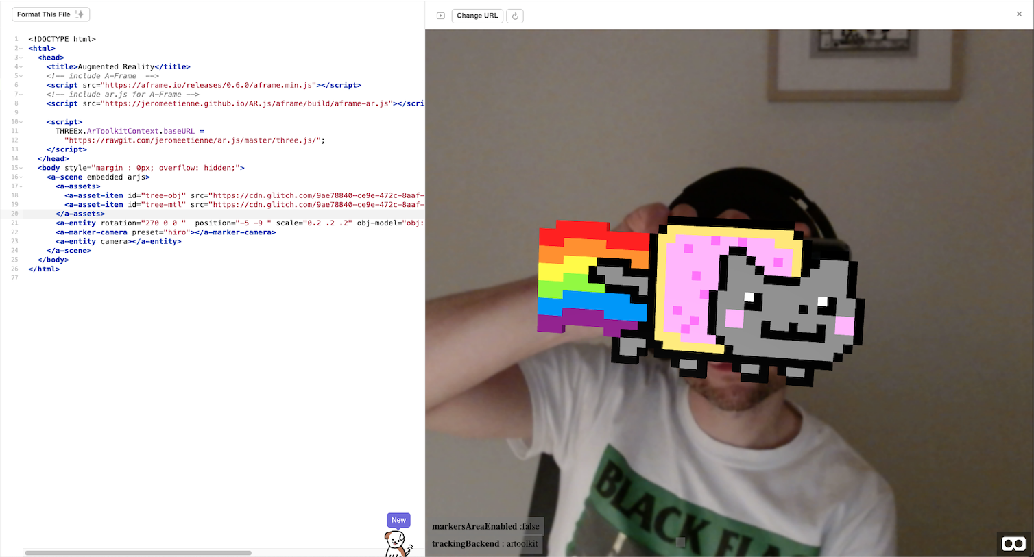
NyARn Cat
I used a custom 3d model (obj/ mtl files) to bring Nyan Cat to life (kind of).
-
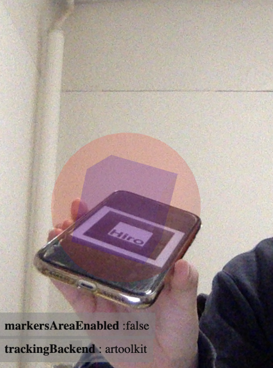
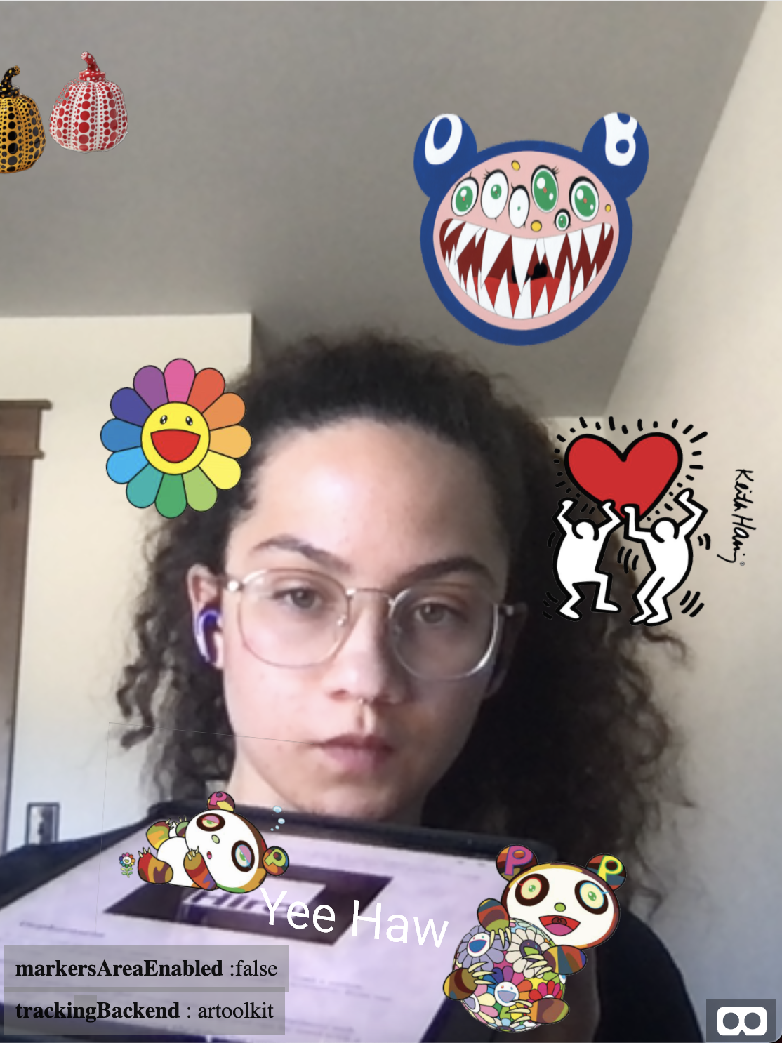
Joy's AR exercise
I used to Hiro marker and played around with some overlapping shapes.
-
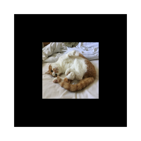
AR.js
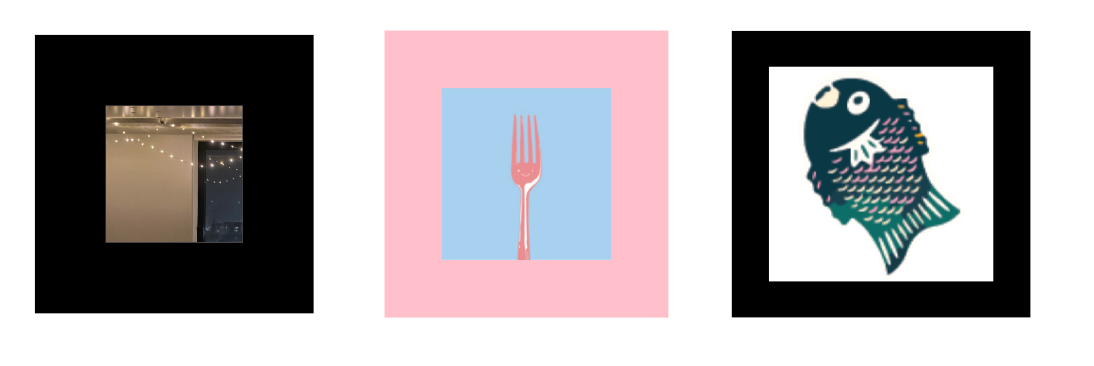
I made a custom marker with a picture of my cat Mango and also added his picture as an AR overlay :)
-
AR.js Exercise
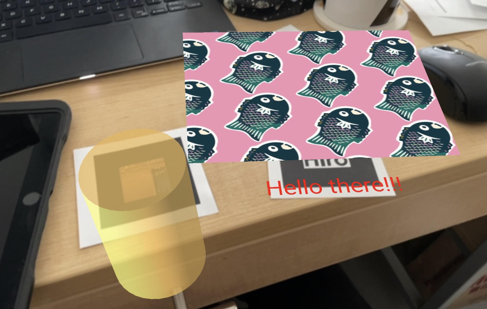
For me, this exercise was a little easier than the API exercise because there was less processing of raw data and less UI development. I created my own markers, and found that some of them worked better than others (and had to scrap almost all of them because they wouldn’t work, mostly ones with low-quality patterns / light borders). I also was having a hard time using the Glitch interface and referencing assets, and it took a while to realize that Glitch was a platform for instantaneous site editing and not something used specifically for AR. I ended up looking up Jasmine’s starter code on Github and instead made a Github Pages instead of a Glitch page.
I have the standard Hiro marker that brings up some text as well as a pattern of fish I made a while back. My other marker is a personally made pattern with an image of string lights inside. It shows a cylinder when in view. I found some code online that plays audio whenever a 3D shape is present, and I used it to play a song whenever the cylinder is in view. The script for it uses JavaScript, and while I can understand generally what it does, I’m still very unused to the JavaScript syntax and the use of components. On the AR.js documentation, they also note that audio requires a user interaction on iOS (like a click), so the script I use doesn’t work on the phone (it does work when I use my webcam on my laptop). I’ve attached some of my custom markers below (only the string light one works, sadly), and an image of the website displaying the components over them. The link to my site is here: https://delacejia.github.io/AR-practice/A-frame/
-
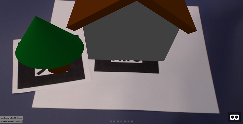
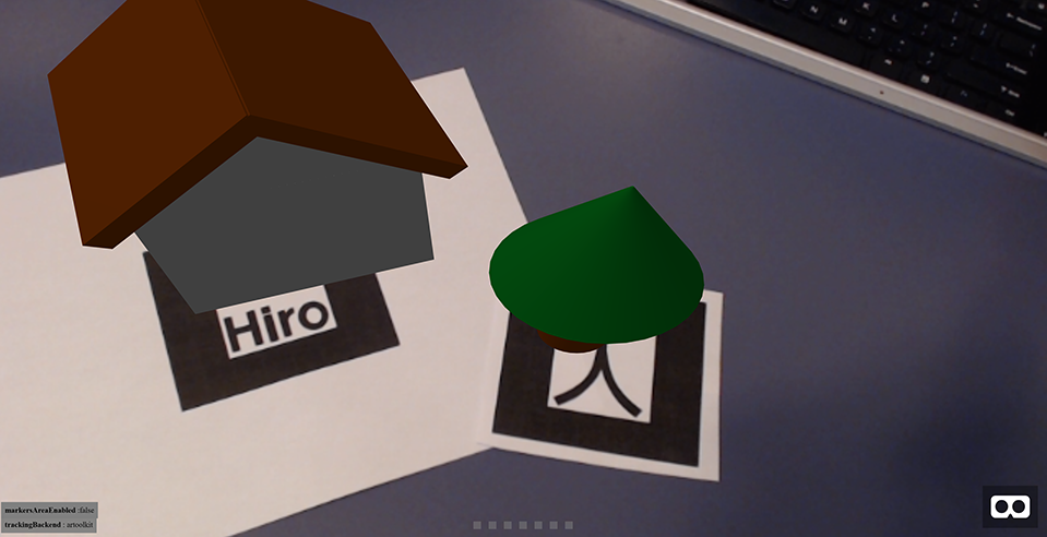
AR.js Exercise - Trevor
I made a scene with multiple markers which control models that represent real world objects. I wanted to build a small, customizable village but because of time constraints I just implemented two basic objects, a house and a tree. With more time I would have liked to add one or two more unique objects and set up the scene to be able to register and track multiple instances of a single marker if possible.
I ran into a couple problems importing assets into my scene. I initially tried to use slightly more complex models but couldn’t get them to render. I ended up just using several primitives to create each object instead. I also tried to create custom markers that used icons representing the objects they corresponded to but the icons weren’t high enough quality to work so I just stuck with the presets.
-
AR.js and Aframe Exercise
I was mostly just playing around with this project and thought it would be fun to have some art stickers pop up and move around, so that’s what I put together here. Right now they’re just 2D images but you can play around with it here.
-
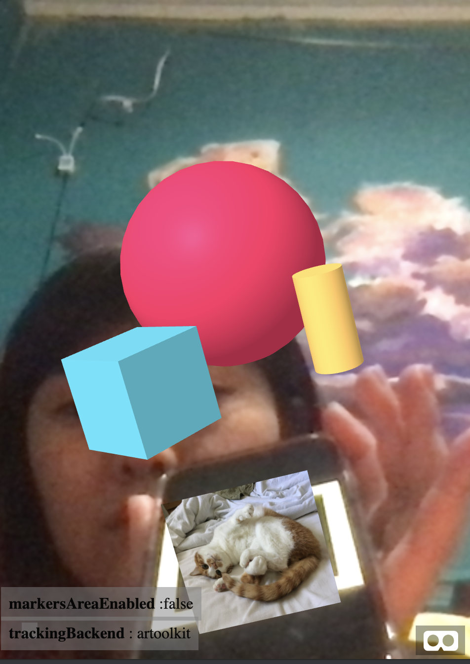
AR exercise
I think this is very fun to work with. I used the hiro marker and made some changes to the shapes.
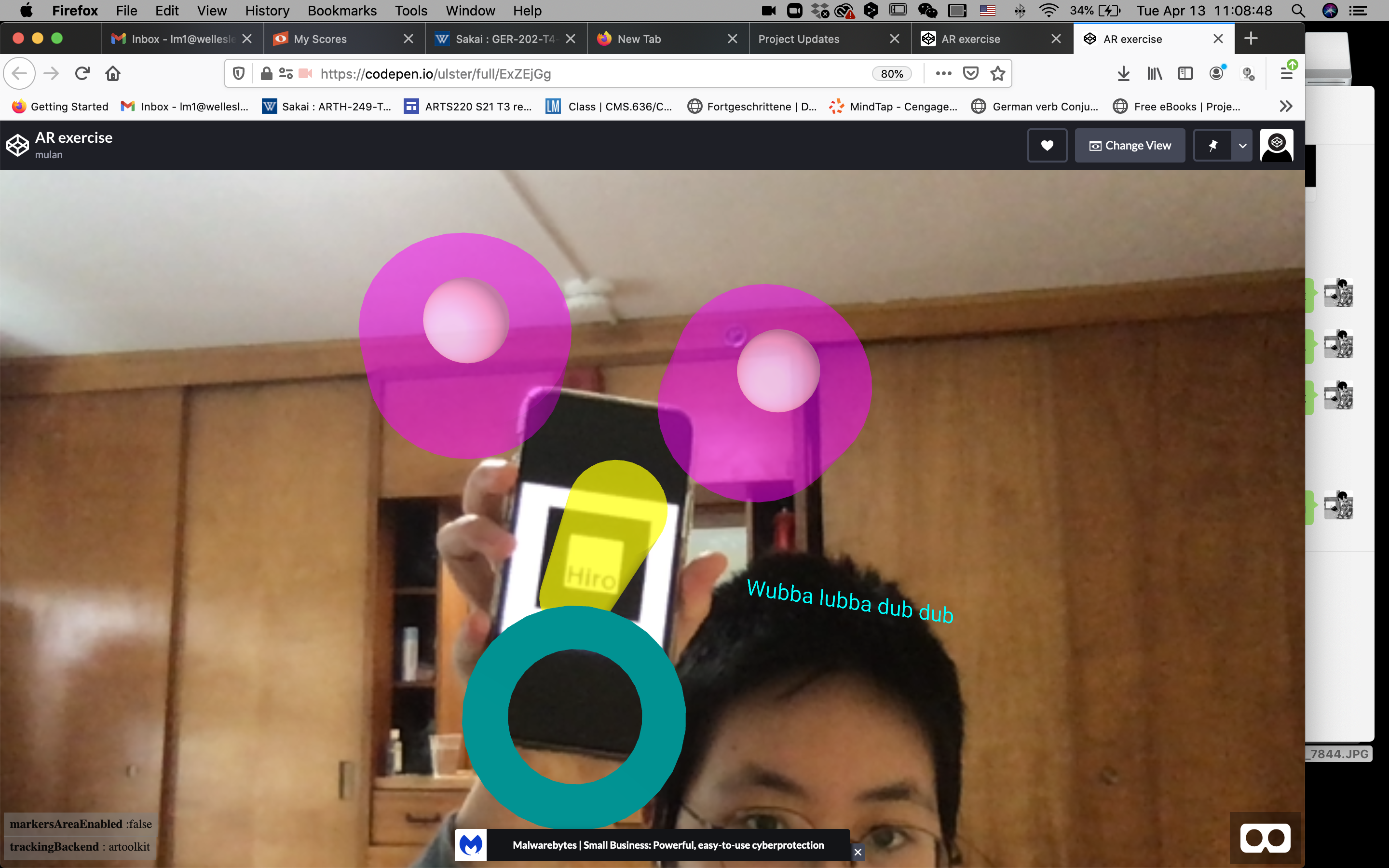 Here is the link to the site.
 -
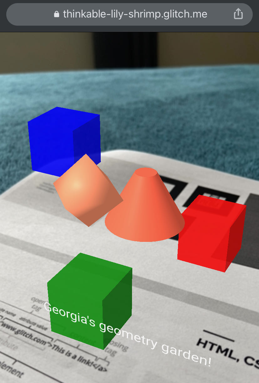
A-Frame example - Georgia's geometry garden
I was able to add shapes and text. I am still in the process of adding an image (of some spring flowers I took last week) to this garden.
-
Participatory Audio Guide April 1 update
Based on the feedback it seems like our best plan of action would be to use the museum visitors phone as the recording device. We can design an interface that generates prompts based on location or artwork viewed. Playing with outdoor artworks also opens a lot of opportunities and helps tackle the issue of having to have a separate recording room. For technology we are still looking into Roundware but it seems like it fits a lot of our needs. One potential challenge with Roundware is that it seems to be used to make continuous soundscapes rather than discrete recordings that can be listened to. We will have to spend some more time experimenting with Roundware to make sure that it allows for enough distinct comments on a piece. Yellow Arrow also brings up another aspect of the recording experience which is time. We are still thinking about if the user should have access to record notes before or after visiting.
Meeting with museums that have more outdoor based artwork would be really helpful. The idea of perspective in viewing one piece is something we talked about as a team. Specifically with larger artwork we thought of how a viewer could hear different voice recordings based on where the person recording it was standing. As there was an art installation in Cambridge with a similar concept using Roundware a few years ago, we would want to make sure that our project is distinct from this in some way.
As for some clarifications on our problem statement, our goal focuses on not changing the art itself, but instead shifting the context it is viewed in through the comments of others. We hope to make the experience of engaging with the art more dynamic by allowing the visitor to hear from different voices and understand the artwork from different perspectives every time they return to the museum.
-
Lost Art update
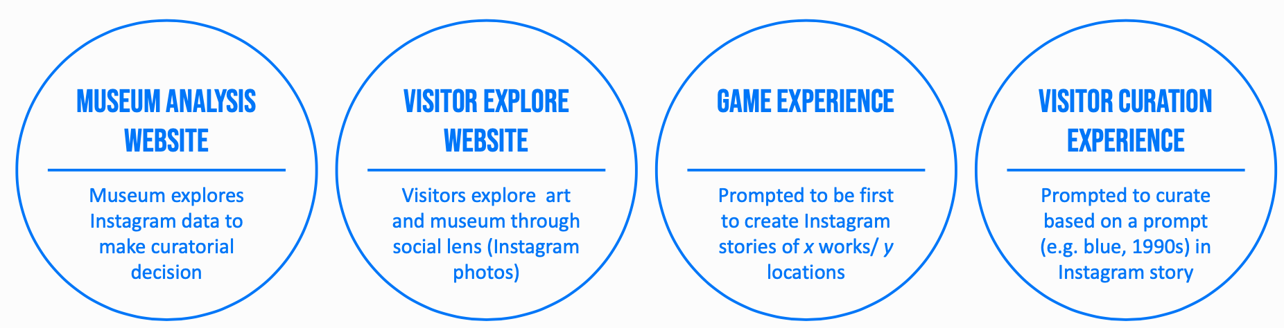
Based on the feedback we received, we filtered down our proposal into 3 separate outputs:
A museum website for curators and visitors with Instagram posts and analytics. This site is intended to help the museum curate new experiences, and for visitors to view the collection through a social lens.
A visitor curation experience using Instagram stories. The museum will generate prompts that focus on less explored works and areas of the museum, for example: “what are your favorite objects from x collection? what are your favorite blue objects?”
A visitor game experience using Instagram stories. Similar to the visitor curation experience, the museum asks visitors to photograph and tag objects that are less viewed. The person who wins will get an award or achievement?
The visitor Instagram stories from the curation and game experience will be shared with the museum— They have the option to share (repost) these on their official account. This also allows the museum to engage with these individuals on Instagram, starting a dialogue about these works. This interaction via Instagram allows the museum to further understand visitor behaviors and interests. We also enivision this being a QA platform– Visitors can ask questions in their posts that the museum could anser.
These concepts unlock the following capabilities:
Museum
- Better understand visitor behaviors and collection engagement
- Engagement and advertising
- Direct communication with visitors
Visitors
- Museum acknowledgment
- Explore art through creative lens
- Social media oriented – simplifies onboarding and overall experiences and no additional software needed
.jpg)
-
ARticulate - April 1 Update
Concept Updates
We’ve updated the concept to include two modes of interaction that any user can experience: submitting responses and viewing responses. This means that users can just view others’ responses without submitting their own. Note: a visitor response includes a comment and an AR annotation.
When people are viewing responses, they will only see one at a time. There will be a button to see the next one in a randomly-generated list. We will make this list so that viewers see all responses before seeing repeats. We will give them a notice that they’ve viewed all responses if they do go through everything.
We want to incorporate the ability for users and museum staff to reply to visitor responses. We think this can allow for a deeper engagement, and an engagement that lasts for longer than the standalone trip to the museum. We imagine that museum staff could have “verified” accounts, so the interface they use is the same as the one other visitors use, increasing the scalability of this feature. We might leave this as a stretch goal until we have a better sense on how quickly we can get the most critical elements of ARticulate working.
We would like to keep the visitor-to-visitor interactions to just comments (no upvoting/downvoting). We chose to do this because we don’t anticipate enough use of this feature to give us enough useful data. If we want to have something like this, we could incorporate something like the NYT uses on it’s comment sections: the “NYT Pick.” With this feature, museum staff could highlight visitor responses they think are particularly insightful. These can be pushed to the top of the viewed list.
We have scheduled a call with Chris Atkins tomorrow to discuss these changes.
Wireframe Updates
We’ve updated the wireframe to display one (randomized) comment at a time, with a button to view the next randomly selected comment. We’ve also added a screen for replying to an existing comment. We decided that the user would be able to view other people’s responses without having to submit commentary of their own.
Code
We’ve started looking at documentation in more detail and performing some early tests to make sure our selected tools will work the way we’re expecting.
-
ARticulate: First Pitch
https://docs.google.com/presentation/d/1cnIxObfAqbWjo-_8ebgvQ1g_QtF_3hI3t96wK0FFHpE/edit
-
Lost Art pitch deck
https://drive.google.com/file/d/1RCvSHNEauPCtJJQaXC4OI-D_pimmLPek/view
-
Participatory Audio Tour Pitch Presentation
-
Working with APIs
I think it took me a bit to understand what was going on so I just played around the code of the second example. I added an ellipse everytime the mouse hovers over the timeline kind of like a reminder of where the user has already looked. I wouldn’t say this is particularly helpful but I think it’s fun to watch all the shapes overlap as you go through each event.
https://editor.p5js.org/jl024/present/3FjkDZ8t_
-
Working with APIs: Collection cultures
I was curious about the number of works in the Harvard collection for each culture (accessed from the api). Since there were a lot of cultures (250+ ?), I opted for a heatmap representation instead of charts/ graphs. I also wanted to create a collage of all of the images for each culture sorted by color, however this would have taken 2000k+ api calls per P5.js page visit. Wanting to be a good nieghbor, I just grabbed the images for cultures that had 10 or less works in the collection and grouped them by dominant color.
-
Working with APIs -Antonella
I am completely new to working with APIs so it took me a while to understand it. In the end, I created this histogram of the frist 8 cultures that when you click on it the bars change of color and display the object count. However, for some reason it sometimes crashes and so you need to refresh the page some times for it to work. I am still trying to figure out why this happens.
-
API trial
I spent some time figuring out what we are supposed to do. I was trying to make a list of the most popular cultures but it ended up looking weird. They are very spaced out and several cultures appear multiple times, so I need some more time to figure this whole thing out. https://editor.p5js.org/lm1/present/p870bEAUU https://editor.p5js.org/lm1/present/24N2rYnqZ just another failed attempt
-
API first pass
I haven’t worked in javascript before, and I have very little experience with OOP, so I spent a while getting used to the syntax. So far, I’ve made a histogram of the first 100 cultures that was suggested as a first example.
I’ll keep working to get something a bit more interesting, and I’ll update this post when I do!
-
API Exercise
I struggled a lot with the exercise and working with the data coming in. I haven’t used javascript before so it was difficult to process the data and also display it on the canvas. In the end I created a list of mediums that have more than 300 instances in the collection. The way I kept track of the frequency and name of the medium were separated in a way that I couldn’t order them, and I had a hard time working with the data when they were together. In the end I kept them separate, so the list isn’t ordered.
-
API Exercise - Timeline Histogram
I decided to do something similar to one of the examples and create a timeline of the objects in the collection. Rather than showing the date for each individual object, I grouped them into centuries and generated a histogram to show how heavily different time periods are represented in the collection. I had planned to have labels appear for each segment of the histogram when hovered but that ended up being difficult to implement. For now, I added permanent text labels next to the histogram instead to make sure that information is available somewhere. Also, in the data returned by the API, the labeling for centuries is inconsistent. From the 20th century BCE up to the 5th century CE, all centuries are labeled as either “BCE” or “CE.” However, from the 6th century CE onward, the “CE” is omitted. I chose not to fix this manually in case the formatting in the data is changed later.
-
API Exercise - Object Classifications
I’m not super great with coding in javascript so it took me awhile to figure out how to make anything happen, but I ended up going with a pie chart of the different object classifications listed in the API. There are 59 distinct object classifications but for the sake of the pie chart I focused on the 6 largest categories and lumped the rest of them together since after that point they get fairly small compared to the rest of the pie chart. It’s not much but I’m happy that it works.
https://editor.p5js.org/edwardsarah/present/g3EhAnvvte
-
Project idea: interactive brochure
Update: Regarding the brochure, I also envision it to be expanded by AR technology, specifically for navigation and general introduction. Similar to Tamiko Thiel’s works, people can use their own devices to view directions and comments. Another project idea that I thought about before is actually similar to Shayna’s idea of viewing AR artworks outside of the museum space. Using their own devices, people can go on a tour at any open space. They can also just be individual works for leisure that doesn’t take a lot of time.
Every museum we go to has brochures that introduce the viewer to the museum in general and/or featured exhibitions the museum is having. People may pick up one when they go to a museum for the first time or in order to learn a bit more about the exhibition in description. But once the brochure is in my hand, I don’t really read it very carefully and it actually becomes somewhat unnecessary. Therefore, I want to find a way to incorporate brochure into the museum experience and give it more purposes.
I want to add interactive functions to its basic purpose of navigation and introduction. For example, visitors can scan the code on the brochure and enter a virtual space where they can take notes, pictures, and short videos and add to the space where they can later return to after their visit or during their second visit. They can also choose to post things in a public space where people can view each other’s notes and reflections. If visitors come with companisons, they can also create things together.
My envisioned audience would be people who hope for a more reflective experience and want to record their museum experience on a single device easily and be able to revisit their experience afterwards. Potential museum collaborators would be MFA and Getty. I’m thinking about a mobile app that will involve programming and UI/UX design, but I’m not very familiar with the technical part.
-
Off the Walls Project Proposal
Update: Reflecting on some of the other project ideas, I think this project could be easily adapted to include more of a museums history in its design and focus. Joy’s idea made me think that maybe the outdoor space could be used as a way to ‘trace’ the history of an object along a physical path, with different AR elements corresponding to key points in the outdoor environment. Additionally, Trevor’s idea of using AR to complete missing pieces or highlight what an earlier verision of something looked like could be adapted to using older photographs of outdoor areas as clues to highlight how an area has changed over time and make finding where different clues point to a bit more interesting. I’m not super committed to this idea, and would be open to helping someone else pursue an alternative project as well.
Outdoor spaces on museum grounds can be important places for people to socialize and enjoy the atmosphere of the museum, but their artistic value can go underappreciated compared to the indoor galleries. For my project I’d propose a scavenger-hunt like experience where museum goers are given images taken from different parts of the museum grounds. When the user finds the area pictured, they can unlock audio or videos of members of the museum talking about how it was created or acquired for the museum. The goal would be to introduce visitors to parts of the museum they may otherwise overlook, and highlight the artistic value of aspects of the museum outside the gallery walls. This was envisioned with the Getty Center gardens in mind, but could easily be adapted to other museums. For easy accessibility, a web-based app would likely be the approach for the project.
-
Final project ideas: lonely objects and moving maps
Update: After learning more about other folks ideas, I saw some overlapping themes with Sarah, Mulan, and Delace’s concepts in terms of adding extra context/ content to collections and thinking about how visitors traverse museums. One variation on the idea I had of determining popular works via visitor tracking is using online, social representations of museums as a way of curating new (“off the beaten path”) experiences for visitors. Many MFA visitors post photos of works they viewed on Instagram and tag the museum. I think using this data to determine artists, works, time periods, etc. that are shared the most could be an interesting way of uncovering under-explored/ unshared areas in the museum. This information could then be used to guide new/ returning visitors towards these areas. This could be in the form of an interactive map, brochure, game, etc. and also provide additional media/ content to incentivize exploration. I’m also curious if these Instagram posts could be recontextualized within the museum.
I came up with two rough ideas that could be explored at an institution with a diverse collection, like the MFA, the Getty museum, or the Met.
What are the least viewed pieces at museums?
Museums often highlight specific works in their permanent collections, rotating exhibitions, and promotional materials. Certain museums are often linked to works in their permanent collection: the Louvre and the Mona Lisa, Neues Museum (Berlin) and the Nefertiti Bust, the blue whale model at the American Museum of Natural History. However, this begs the question– Which works thus remain neglected, and fall outside the periphery of typical visitor interest? Poor placement, uninteresting aesthetics/ content/ context for a visitor, and bad art (I’m kidding!) could all be contributing factors to why certain pieces aren’t viewed as much as others. If so-called “blockbuster” works are now sometimes Instagram props for digital experiences, can digital tools actually reconnect visitors to look at and engage with art, rather than photographing it, as their museum experience?
This project seeks to understand visitor attention toward specific pieces in a museum, reveal patterns as to why certain works are engaged with more than others, and guide viewers towards less-viewed works. At a (super) high level, it addresses the following questions: Are there patterns between which works are viewed more often and which works are less viewed? Are there patterns between artists’ demographic profiles, geography, content, style/ school among highly visited/ neglected works? How can neglected works be given more relevance?
This project would be ideally be designed for two specific audiences: Museum curators and researchers to 1) study what works interests viewers the most 2) collect analytics about visitor traffic throughout exhibits 3) reveal patterns vis-a-vis (un)popular works; Visitors to 1) highlight works/ areas that they might normally miss when following the traditional paths throughout the museum 2) have an opportunity to view objects/ works by artists that are scarcely documented/ photographed and hard to find outside of the museum.
The technical implementation is pretty open-ended. One literal and granular approach would be to: 1) Create a dataset with metadata about each work in a museum including information about the creator, place of origin, date, and content features (e.g. spoon, horse, etc.). 2) Build a tracking system to determine viewer presence and duration in front of a specific work (computer vision, bluetooth/ wifi beacon sniffing, infrared/ ultrasonic sensors, or QR codes). 3)Analyze the visitor engagement for each work and the metadata associated with the work to detect patterns (example: paintings of cats between 1700-1900 have the most traffic) 4) Create a tool/ app/ intervention that guides visitors towards lesser viewed works, And/ or create a tool for museum staff to make sense of visitor traffic in relation to types of works. (example: you might want to check out this painting of a dog from the early 1400s). An alternative approach to #2 could be to analyze social media posts tagged/ associated with the museum to see which works are shared the most.
I think web development (HTML/CSS/Javascript), data science (NLP, classification), and/ or UX/ UI design skills would all be relevant. In the example above, the tracking system could be simulated/ fake dataset.
Many museums have security cameras, and a real-time tracking systems (that doesn’t save footage) could live on top of this existing infrastructure. Still, tracking visitors via cameras, Bluetooth/ WiFi beacon sniffing, raises privacy concerns that should be considered in the course of the project, or even before, to inform whether the project should be explored.
Rethinking the Museum Map
Planning a visit to a large museum with an extensive permanent collection can be overwhelming. Museum maps typically provide a spatial reference that’s only segmented by collection, current exhibits, time period, geography, etc. They also segment the museum statically, often treating individual rooms as sections of larger collections or wings rather than their own unique spaces. How can museums be redefined spatially without changing the space itself? How can visitors navigate museums in ways that’s specifically curated based on their own interests?
This project explores creating dynamic, personalized maps of museums based on the features and information embedded in the works in a collection. Instead of choosing their path based on traditional descriptions and groupings, visitors can select different features they’re interested in to inform their route. For example, all monotone paintings, pictures containing cats, or works created when an artist was in their 20s whose name begins with the letter “H”. Based on these selections, a new map is generated for the visitor showing them their curated path throughout the museum, across different rooms, exhibits, floors, etc.
Given the immmense amount of planning and consideration that goes into museum architecture, I think it’s important to contextualize this tool within the map itself rather than creating an entirely new one. This tool uses the existing physical museum map as a canvas for an interactive AR experience that visualizes a personlized, curated route. Visitors first visit a website on their phone or an interactive display at the museum where they explore the archive via various filters, features, etc.. Once they’ve selected their interests, the app generates a route creates a shortened url (that can be scanned as a QR code) which directs to an mobile AR app. Visitors scan their personal map (or one on a wall) and see their route overlaid, which can provide additional details about a work once a user is within proximity.
This tool would ideally be designed to allow visitors to navigate the museum in ways based on their own interests. However, this information could also be useful for the museum to discover their visitor’s nuanced interests and how that relates to the location of works. Some examples of analyzing images/ grouping/ filtering objects include clustering images based on visual or content similarity (e.g. blue paintings, pictures of cats), creating topics from works across collections (e.g. all works related to birth/ death), and other approaches. Each path would be saved, and when a new visitor enters a similar criteria the application could suggest similar paths/ works they might be interested in.
I think web development (HTML/CSS/Javascript), data science (NLP, classification), data visualization, web scraping, AR experience, and/ or UX/ UI design skills would all be relevant (but absolutely neccessary to create a prototype.)
-
Final Project Idea - Shayna
SnapBlock
- A description of the issue/problem that you are trying to address;
I envision this project extending the museum experience outside the physical museum walls. Given the state of the pandemic, where indoor spaces have occupancy limits and should be avoided generally, it would be beneficial to do outreach to experience museums and other cultural institutions at home, on your own equipment. Much like Tamiko Thiel and her associate’s approach to guerilla AR art such as at the “invasion” of the Met, I could see extending AR filters as an intentional part of a museum.
I propose creating Snapchat Lenses (live 3D image filters) with relevant experiences for different places of museum significance in the MIT area. It could indicate spots for best viewing, and have a “map” of codes to activate each lens at the right spot, elevating a walking tour to an experience. Much like how audio tours hope to enhance a museum visit, I think this experience can use the museum curation to enhance a visit just outside the museum.
In particular, I’m interested in creating an interactive demo overlaying AR representations of the Minecraft-ified buildings on campus, with a small “coloring” palette as a test.
- The envisioned audience for your project;
Museum visitors of all ages that can use a smartphone would be able to use this program, and it’s likely to would capture a wide range of ages and interests.
- Potential museum collaborators (currently MFA; Harvard Art Museums, MIT-Museum, Getty, and others are possible as well);
The MIT Museum is an obvious collaborator due to the central location in the MIT area and its relation to historical sites and places of technological significance just a stone’s throw away.
- The technological approach (if part of the project)
A Augmented Reality experience built as a Snapchat Lens. The software LensStudio is well supported, and Snapchat being a common enough messaging app, would be able to get this project in the hands of more people.
- Skill sets needed for your project.
Some level of 3D design and familiarity with scripting would be needed for the project.
-
Final Project Idea: Hold My Thought
update
After hearing other people’s thoughts, I realized that if I continue moving forward with this project, I would have to add some sense of purpose. For example, someone suggested making the whole experience more game like and to make the outer walls transparent so that the public would be able to see what is happening from the outside. I was also looking at other people’s project ideas and realized that Sarah and I were intending to use museums’ spaces to create our own experience. I think that there is room for improvement here since what I would ideally want to create is something that is integrated in the museum, that is part of the museum, not that it merely uses the museum as a location.
Working Title: Hold My Thought
The museum experience is often regarded as something personal but this doesn’t have to be the only way. I think that museums would benefit a lot from encouraging members of the public to interact with each other and in that way create a more united community. In addition, discussing the presented information with others also helps visitors to retain it in their minds. My audience would be visitors of all ages who would like to experience a connection with someone else. Who would like to try something different and share their thoughts with another person. The intended museum collaborator would be any museum that is open to the idea of getting their public more involved with the exhibits through mutual communication. The Boston MFA or the MIT science museum could be interesting options to explore.
My project idea would be to build two small rooms adjacent to each other inside a space of the museum. They would have an entrance on opposite sides and a chair in the middle facing the other room. There will be a projector displaying some of the items of the museum on the walls of each of the rooms. A question will then appear on the wall dividing the two rooms but only for one room. The person will be asked to read it outloud and, through a microphone, the person in the other room will hear it and answer it. Then this person will be the one asking a question. Questions will be about items in the museum, or items that are being projected on the walls. Their interpretations, if they like them or not, etc. But other questions will be more about the person, such as what makes you happy? Why did you come to the museum today? etc. I think that mixing the questions will not only create a bond between the people but also a bond between these people and the museum.
Sketch: https://ibb.co/rdvQDdC
Skills needed for this project: Video editing skills for the projection in the room. Some coding skills perhaps to write a program that will output these questions.
-
Final Project Idea - Historical Lens
Update: Due to the need to work with physical objects, I think my original idea might be difficult to execute during the pandemic. Audrey, Georgia, and Shayna had all proposed augmented reality projects as well and I would be interested in working on developing any of those ideas.
Many objects in museums and at historical sites are heavily damaged or are incomplete fragments of a larger piece. In some of these cases, historians have been able to develop descriptions or visual representations of the original appearances of these objects which are likely fairly accurate. However, these attempts to depict the original appearance of an artifact can feel disconnected from the actual object.
Historical Lens will be an augmented reality app used to display these recreations in the same physical space as the object. It’s important that the objects being explored will truly be augmented when viewed through the app and not just immediately replaced by a digital model. Options would vary based on what information is available for each individual piece, but ideally, users would have several different ways of viewing an object such as superimposing a wireframe of the complete piece over a fragment or slowly fading in a digital recreation over the object.
This idea was partially inspired by a low-tech solution I’ve seen used at two historical sites, The Heidentor in Austria and Kruševac Fortress in Serbia. However, Historical Lens will be focused on smaller artifacts in museums rather than large-scale ruins. Objects explored in the app will likely fall into two categories, objects which are physically incomplete and objects which are complete but have changed significantly in appearance over time. Some examples of historical artifacts that fall into the first category are the Venus de Milo (current appearance and 3D model of a proposed restoration) and a papyrus fragment from a copy of the Book of the Dead (current appearance and proposed reconstruction). The second category would mainly include paintings. The Mona Lisa and The Last Supper are famous examples of paintings that have lost clarity or even entire features over time.
The intended audience for Historical Lens will be museum visitors using tablets provided at the museum or a downloadable mobile app. Potential museum collaborators will be the Harvard Art and History Museums or the Museum of Fine Arts. Development will require programming, UI/UX design, and 3D modeling. The scope of the project will also be very dependent on what data museum partners have about objects in their collection that would benefit from augmentation.
-
Final Project Brainstorm: Youth Involvement and Complete Consumption
UPDATE: For Youth Over Yonder, I think the idea could expand beyond a resource and more into a tool for engagement. This could mean beyond getting museum youth prices, also creating some type of interactive points system or sharing apparatus that would work to engage teens from their experiences at a museum. I’m still a little uncertain on what tools would engage teenagers, especially because I’m no longer one :/
Considering my Complete Consumption idea, I do still like the idea of a holistic experience being curated for you beyond the museum visit. I do realize, however, that creating connections between experiences is not that easy. An update I have for this project idea is that maybe the suggestions aren’t necessarily experiences such as restaurants or other attractions for one to visit, but are instead things like recipes and books and other entertainment and media that are related. The user would scan a piece of artwork at a museum, and the program would return tidbits about the history, process, or artist of the piece and then provide photos with links to related media.
I think my idea of providing extra background into the creation and miscellaneous background of an art piece could potentially be connected to other projects. I really like Justin’s idea of looking at the foot traffic of museums, and it would be cool to somehow have a two-way system where the user scanning for more information also provides information to the app of what pieces the user decided to scan. I also like Mulan’s idea of enhancing museum brochures and can see how it could connect to my idea, where maybe the user scans a QR code on the brochure and gets these related experiences and background information.
Youth Over Yonder
- The problem this project aims to address is the low participation of the youth in cultural experiences such as museums. The project would attempt to provide a resource where museums with discounted youth prices are collected in one area for students to reference.
- The envisioned audience for this project would be teenagers. Parents with younger children could also potentially use this project.
- Potential museum collaborators would be ones with a very strong interest in youth engagement. Potentially the University museums where student prices and student participation are prominent.
- The technological approach would include something similar to the Artbot methodology. A front-end website would allow users to log in and find museums and their youth admissions in the area. In the backend, the website would scrape museum websites in the area and return their youth prices.
- Skills sets needed: Web design, Web scraping
Complete Consumption
- This project would attempt to address the issue of museum engagement and the longevity of an experience on an audience. This project would aim to create a more memorable experience by providing experiences that tangentially relate to details in a primary experience. A prominent example of this would be providing restaurants that have themes similar to museums exhibitions, or similar cultural backgrounds.
- The envisioned audience for this project would be people who go to museums as a part of an outing rather than for the museum itself. Something like families or adults who have a ‘day trip’ just to go out, and do arrive at museums with the intention to fully connect with all of the objects inside.
- Potential museum collaborators: Art museums, local restaurants?
- Technological approach: I imagined utilizing museum databases, artwork databases, and restaurant menus. These would either be accessed through finding a database or scraping websites. The restaurant menus on their website would be scraped. When a user submits a museum or exhibition that they visit, the project would look for keywords in the artwork description/artist background, and then match it with an experience nearby.
- Skills sets needed: Web design, Web scraping, Databases
-
“Hang your painting in the Louvre” - Final project concept
Update: After hearing others’ project ideas and reading the updates, I think my concept could morph into one of Audrey’s concepts. When I explained my original idea, Justin proposed that if users upload their own photo, that the app could apply a filter to make it match the surrounding paintings, style-wise. Audrey said that one of her concepts was to perform a style transfer onto specific artworks. I would want to make sure the user experience of this action helps them learn or engage with the art more deeply, and not that it’s just a cool trick. But I think there is something there, and it could be especially useful as an overview of the different galleries a single museum has to offer. Imagine at the front of the museum is a piece that everyone is familiar with. They can then apply the different styles, and the app could tell visitors where to go to see each style. This becomes the start of an interactive map, which I know a number of others were thinking of pursuing.
This concept allows museum visitors to fully participate in the museum experience by allowing them to showcase their artwork in a gallery.
Before going to the museum, visitors are promoted to take and upload a photo of some artwork they created. At the museum, one gallery has a number of “empty frames” of varying sizes. Visitors download an app (or use a provided tablet), and hold the screens up to the empty frames. AR technology puts the visitors’ uploaded artwork into the frames. Visitors can find their own artwork to see it in a museum. They can also browse & upvote others’ pieces.
A similar effect could also be accomplished without AR, using digital screens in the frames to flip though all the uploaded visitor artwork. This would allow the entire room to see the same piece at the same time, but it wouldn’t allow for the personalized experience that AR would. Early tests and interviews with stakeholders could confirm the best direction.
This concept was inspired by a story my dad told me. His friend wanted his artwork to be hung in the Louvre, so he brought a piece, taped it to the back of a bathroom stall door, and decided that it “hung in the Louvre.” I did the same when I visited in high school. While this concept is inspired by the Louvre, I think this would just as well at the MFA or ICA in Boston. Aspiring artists could be discovered this way, and students or hobbyists would have fun participating in the museum experience this way (like I did at the Louvre).
I haven’t used AR technology before, but I imagine the physical frames would need to be easily detected by the phone or tablet. Then the uploaded artwork would need to be distorted to fit in the frame correctly. A simple UI could allow museum visitors to scroll through artwork and upvote ones they like. There is also the artwork upload side of the project. Ideally, the upload tool would find the edges of a piece to crop correctly and could allow for some post-processing of an image to enhance lighting and contrast. Coding/AR/app skills are needed for these two parts of the project, and physical fabrication skills would be needed to create the frames.
-
Museum Project Idea
(Un)finishing Touches
In the traditional art museum, interaction between the museumgoer and the exhibit is often limited by “do not touch” signs, glass walls, and rope barriers. As a result, exhibits become “untouchable,” physically and possibly also socially. Through an augmented reality app that allows users to virtually graffiti exhibits (and possibly collaborate on graffiti with other museumgoers), we can disrupt the idea of untouchable exhibits. Museumgoers are not only encouraged to (digitally) touch exhibits, but add their individual creativity to them and as some people might consider, ‘vandalize’ them. I’d expect that some users would intentionally artistically augment exhibits, whereas others would intentionally mess around with them, such as drawing comical mustaches on figures’ faces. This begs the question, when is graffiti and street art considered “art,” and when is it considered “vandalism”?
The audience would be for all museumgoers — it would be interesting to see whether/how different demographics would contribute graffiti differently. The intended museum collaborator would be an art museum such as the Boston MFA.
To be honest, I’ve never developed a mobile app before (just a web app through the web.lab course), so I am not 100% sure about the technological approach. User authentication and a database will be needed to store individual users’ augmentations. ReactJS and HTML/CSS can be used to build a dynamic frontend. In a web app, HTML canvas can be used as a drawing interface, and chances are there’s something similar for mobile apps. There are probably libraries out there for integrating AR in a mobile app. Someone in Borderline (AR murals club) is developing an AR app, so I could possibly ask them for pointers. Skill sets include app development and background/field research on critical examination of graffiti in the context of art and society.
Updates: After Thursday’s class, I realized that another potential direction that this can go in is leveraging style transfer models to transfer the style of one museum artwork onto the content of another via an AR overlay. Because style transfer is already pretty established, I’m willing to bet that there’s an API/library out there that does it for you. If not, there are’s definitely open source models that can be deployed onto a cloud platform that can be called in a web app. There’s already a lot of existing web/mobile apps that do style transfer for custom images, but I haven’t seen style transfer being used as a participatory element in a museum setting. My ideas are similar to that of Georgia’s in that we both proposed participatory AR apps that involve user contribution and possibly collaboration between different users.
-
Project Idea
Update: I want to lean more into telling a story of objects in a way that is digestable and using unique aspects of artifacts and artworks as a part of that story. Another interest I have is using similarly told stories to be curated into it’s own exhibition. Perhaps it’s a certain painting technique or art style that you would like to see more of, there would be a curated exhibition based on your interests that help you gain more out of a museum experience.
My idea, tentatively called Trace, is attempting to address finding the best way to learn the history of objects and exploring different aspects of artworks, cultural artifacts, crafts, etc. I want to be able to tell the story of how objects are made and highlight the process in which they were created and then preserved.
For example, in Kristen Gresh’s Memory Unearthed exhibition, photos and negatives created by photojournalist Henryk Ross are shown. Ross was ordered by Nazi’s to take photos in the Lodz ghetto. While he worked, he secretly took photos of what life under Nazi rule looked like. He buried the negatives only for them to be uncovered. Having background information negatives and contact sheets can help audiences better understand why the survival of these pieces of history are important. In order to tell the best stories about pieces, a deep dive on aspects a viewer might not have thought about before can drastically change the way they value the work they see.
My envisioned audience would be people who attend to learn more specific things about what they see. I think that Kristen Gresh could be a really good resource in terms of photographic interest but this concept can be applied to really any artifact, sculpture, or painting etc. In terms of technological approach I am thinking of a digital platform or even an attachment/extension to online exhibitions.
-
curatorial project: memory leaks
I created a collection called “Memory Leaks”. It’s a series of objects containing currpted data that now serve as momentos of past experiences.
I made a poster with the images and desciptions and also created a presentation.
-
Curatorial Project - Gifts
full presentation here: link
-
Curatorial Project: 2.009 Objects
View PDF here
-
Curation: I want to remember that trip to Japan
I made a booklet that includes general narrative and specific descriptions for each object. Since I included words on both directions, you can check out zoomed-in general descriptions and object information.
-
Curation Exercise - Trevor
I curated a set of objects under the theme of “wear and tear.” The objects and their explanations can be seen in this powerpoint.
-
Curation Exercise: They Linger on the Mind
I curated my objects under the theme of lifelike characteristics, and the way these elements impact how I interact with the objects. I compiled the objects in this website. You can click to view an object and its explanation, and reveal its lifelike characteristic and how my observations change based on it.
-
Curation: 2021 Emerging Adults
These have been some rough months for many soon-to-be-grads. I wanted to make an exhibit that could portray the feeling of loneliness that many of us have experienced. Feel free to visit my website to learn a little bit more about it: https://amasini3.wixsite.com/my-site
-
Personal Artifacts
I curated my personal artifacts under the theme of “Vibrance.” Each object is artistically vibrant itself, or carries vibrant stories of community and joy. More detailed descriptions of my personal artifacts’ backstories and what they mean to me are in this powerpoint link.
-
Curation Exercise
I created a really long layout with the idea that it could be folded into a small pamphlet. I have a basic theme that I’ve expressed but I thought I would just clarify that my whole theme was choosing obscure or interesting items that my friends and I have collected while living on the same floor for the past semester. Two of them ended up going home for this semester so my room is shoved full of random things they couldn’t store.
I included an image here but it might be easier to zoom into through this link.
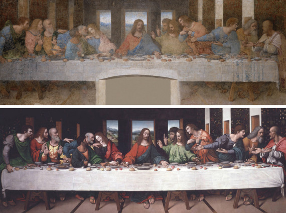